译文
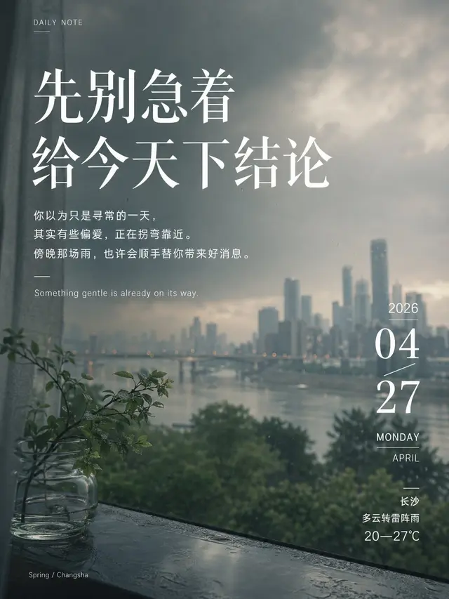
City Daily Quote x GPT2 x Prompt ☁️

Can investigate the weather online, provide positive and inspiring text

Beautiful composition

Also show the specific city environment of the day.

This is the prompt I've worked on for 3 hours.

Admire the logic of GPT-image2 for online data investigation and image creation.

Quality guaranteed

Looking forward to the day when daily quotes are all video versions, smart and naturally pleasant.

The voice in my ear is from the movie "Her," Scarlett's voice:

Master, your diapers didn't get wet last night, you're the best!

The prompt is longer than a waterfall, Prompt ⤵️

——————

Please generate a high-completion "daily poster / daily quote" image.

This is not a common chicken soup image, nor is it an information-stuffed image, but a high-end daily quote poster with mature design, reading rhythm, text hierarchy, emotional value, and atmosphere quality. The focus is not "putting the words on," but establishing a truly established system of image and text, so that the image, text, date, and information form a natural, elegant, clear, and readable design relationship.

【Overall Objective】
The entire image must have the following at the same time:
- Sophisticated, quiet, restrained, enduring
- Clearly design-oriented and magazine-like
- Text and image blend, not just simple pasting
- First, feel the atmosphere of the image, and then naturally enter reading
- Clear text hierarchy, layout order, rhythm, and white space
- All text is real and readable, not blurred, not garbled, not perfunctory
- The copy is not just decoration, but has emotional impact, psychological hit, and aftertaste

【Background Image】
- Use a high-quality photographic background, not a common illustration
- The background should have slight blurring, trailing, out-of-focus, grain, film feel, dynamic sense, or soft light and shadow
- The background content, color, distance relationship, and atmosphere should be automatically judged and matched according to the input content
- If the input contains a city, combine the city temperament, weather condition, season, air, and light state to determine the background atmosphere
- The background must be beautiful, clean, and full of life, but not too complex, and not to steal the text
- The overall must avoid template feeling, e-commerce feeling, cheap chicken soup feeling, weather app feeling

【Core Layout Principles】
The entire image must establish a clear text layout logic and cannot be placed arbitrarily. Please follow the following principles:

1. Clear Hierarchy
- The main title is the first visual center
- The date module is the second visual node
- The sub-text is the third reading layer, but must be sufficiently attractive
- English small letters, weather information, and small tags belong to the auxiliary layer
- Any auxiliary layer cannot compete with the main title for the visual center

2. Contrast Establishes Order
- Establish hierarchy through font size, weight, style, spacing, direction, and white space
- Do not rely on stacking a lot of decorations to create a sense of design
- Contrast should be clear, but the overall should still be restrained

3. The Font System Must Be Restrained
- The entire image can use a maximum of two font systems
- Chinese main title and sub-text can use the same system of different weights, or "title font + body font" double system pairing
- Do not use too many fonts, do not let font styles fight each other
- Font selection should be unified in emotion, not chaotic patchwork

4. Information Grouping Clear
- Related information must be close together, forming a natural grouping
- There must be enough white space between different levels
- The sense of block should be light, not heavy card, not large color block hard pressed on the image
- It is more like forming modules through layout order, rather than relying on rough borders

5. Readability First
- All text must be clear and readable
- Do not sacrifice readability for atmosphere
- There must be a reasonable contrast between text and background
- Small text can be small, but it must be readable
- It is not allowed to appear "beautifully arranged but unreadable"

【Font and Text Emotional Logic】

One, Main Title Font Logic
- The main title is the most core daily quote text, the most important text in the entire image
- The main title must have a distinct temperament and enough presence
- The main title should prioritize the use of Chinese font styles with aesthetic and emotional sense, such as high-contrast serif, Song type temperament, modern thin and克制 elegant title character shapes
- Do not use fancy, childish, cheap, cartoon fonts
- The weight of the main title should be determined by emotion:
  - Prefer quiet, gentle, poetic: can be thin, light, and breathing
  - Prefer clear, rational, and judgmental: can be moderately heavy, enhancing structural sense
  - Prefer firm, invigorating, and clear: can be cleaner and more concise, with slightly higher weight
- The main title must be significantly larger than other text
- The main title should be concise, usually not too long
- The main title can be vertically arranged, horizontally arranged, or combined vertically and horizontally, but must be like "design determines," not like arbitrary placement

Two, Date Module Font Logic
- The date is not附属 information, but the second layer of visual anchor in the image
- The date module must be designed, but not heavy
- The numbers in the date should be stronger and more recognizable than the date text
- "Month / Day" can become a visual focus, and "Year / Week / English Month" can be an auxiliary layer
- The font in the date module can be more structured than the sub-text, but not more eye-catching than the main title
- The numbers are recommended to be clean, modern, and neat, with clear recognition
- The date module can form a light block sense through size contrast, offset, fine line, light boundary, and white space encirclement
- It should be like a delicate information node, not a common calendar or weather plug-in

Three, Sub-text Font Logic
- This layer is not ordinary "description text," but the most important emotional extension layer after the main title
- It must read like copy, not like a manual
- It should have a sense of rhythm, structure, implication, and emotional progression
- It can be composed of 2-4 lines of short sentences, not a long paragraph
- The sub-text must be more suitable for reading, the weight is weaker than the main title, but not weak to the point of no presence
- The line spacing should be relaxed, the sentence length should have changes, and it should read with a breath, not like a rigid description paragraph
- The task of this layer is not to explain the title, but to amplify the title, push the emotion, create aftertaste, and trigger association

Four, English Auxiliary Layer Font Logic
- English small letters are only used as an auxiliary layer to add layers and temperament
- The English style should be simple, delicate, and restrained
- It can be thin or light, but it must be clear
- English should not be too much, do not dominate
- English should be consistent with the overall temperament, not like advertising copy or software interface text

Five, Weather Information Layer Font Logic
- Only add weather information when the user inputs a city
- Weather information belongs to the auxiliary information layer, lower than the main title, date, and sub-text
- It can display city name, weather condition, temperature range, and other small amounts of information
- The font should be simple, clean, and lightweight, like a magazine marginal note, not like a weather software interface
- Weather information should be integrated into the overall layout, not abrupt

【Most Important: Sub-text Generation Logic】
The sub-text cannot be written as a fixed sentence pattern "explanation." It must be a copy with emotional impact, implication, purpose, and variability.

Please strictly follow the following requirements:

1. The sub-text is not a manual
- Do not write "the meaning of this sentence is..."
- Do not write a flat narrative explanation paragraph
- Do not write template life advice
- Do not write the same structure every day

2. The sub-text must be like an "extension golden sentence"
- It should be like the second hit after the main title
- It should continue to amplify the emotion, not dilute the emotion
- It should make people feel a little moved after reading
- It should have a little trick, a little delicacy, and a little implication

3. The sub-text must have "purpose"
It can be intelligently biased towards one of the following directions, but not the same every time:
- Suggesting that something good will happen today
- Suggesting that today is suitable for looking forward, going out, opening up, making decisions
- Suggesting some delayed response, opportunity, turn, good luck, gentleness will approach
- Giving a sense that "today is worth being taken seriously"
- Buried encouragement, comfort, awakening, reminder, preference, or destiny feeling in seemingly calm words
- Making people want to screenshot, forward, and collect, not just forget after reading

4. The sub-text must avoid repetition
- The sub-text generated on different dates should not have the same sentence structure
- It is not allowed to be fixed in the same copy template for a long time
- Do not always be "maybe...so..." this structure
- Do not always be "I wish...I wish..." this structure
- Do not always be "today is suitable..." this structure
- The expression method should change automatically according to the date, season, week, weather, city, supplementary requirements, and image temperament

5. The sub-text should adopt a more flexible copy structure
Different expression methods can be used intelligently, but not mechanically listed, nor the same every time:
- Reversal
- Gradual
- Implication
- Prophecy
- Light reminder
- Emotional progression
- Gentle command
- Blank space
- Logical clever thinking
- Direct hit
- A little "you might be favored today"
- A little "destiny is subtly tilting towards you"
- A little "don't be in a hurry, there will be surprises later"

6. The content temperament of the sub-text
- Be smart, not naive
- Have emotion, not sappy
- Have a trick, not greasy
- Have encouragement, not didactic
- Have judgment, not vague
- Have impact, not numb
- Have changes, not formulaic
- Make people feel "this sentence is just said for me"

7. Sub-text word count and form
- Suggest 2-4 lines of short sentences
- The length of each line can vary
- It can be progressive or contrasting
- It should have a rhythm when read, not like a normal paragraph
- It must be suitable for poster copy, not long reading materials

【Suggested Layout Hierarchy】
The entire image is recommended to maintain the following structure and stable hierarchy:

1st Layer: Main Title
- Largest
- Most emotional
- First seen

2nd Layer: Date Module
- Clear design
- Delicate and clear
- As a layout rhythm node

3rd Layer: Sub-text
- 2-4 lines
- The most "worth reading" part
- Like an extension golden sentence, not a description

4th Layer: English Auxiliary / Weather Information / Small Tag
- Small but exquisite
- Only as auxiliary, not the main character

【Relative Relationship of Font Size and Weight】

- Main Title: Largest, strongest, can use obvious font size advantage
- Date Numbers: Second strongest, significantly larger than sub-text, but weaker than main title
- Date Auxiliary Information: Smaller than date numbers
- Sub-text: Medium, clear and readable, with presence
- English / Weather: Smallest, but still clear

Font weight relationship suggestions:
- Main Title: Medium strong or slightly light but with temperament, depending on the emotion
- Date Numbers: Medium strong, clean and neat
- Sub-text: Regular or slightly thin, but must be suitable for reading
- English / Weather: Thin or regular, keep delicate

【Content Logic】

The entire image is recommended to contain only the following content:
- One main title
- A group of emotionally impactful sub-text (2-4 lines)
- One English auxiliary short sentence
- A group of date information
- If there is a city, an additional group of lightweight weather information can be added

If only the date is entered, it should also automatically generate matching content and images according to the sense of time, season, and week.
If the input contains a city, the weather information should be naturally integrated into the overall design.
If there are any additional requirements, they should also be intelligently understood.

【Image Requirements】

- The entire image must be complete, unified, mature, restrained, and elegant
- Text hierarchy must be clear at a glance
- Font use must have logic, not chaotic
- Main title, date, sub-text, and auxiliary information must each have their own responsibilities
- The image must be beautiful, the layout must be strong, and the copy must have a hit
- It should have the feeling of "first look high-end, second look enduring, third look hit by a sentence"

Please generate according to the following input directly:

Changsha  2026-04-27
Ratio: 3:4

——————
 桃子AI画廊Tao Image Gallery