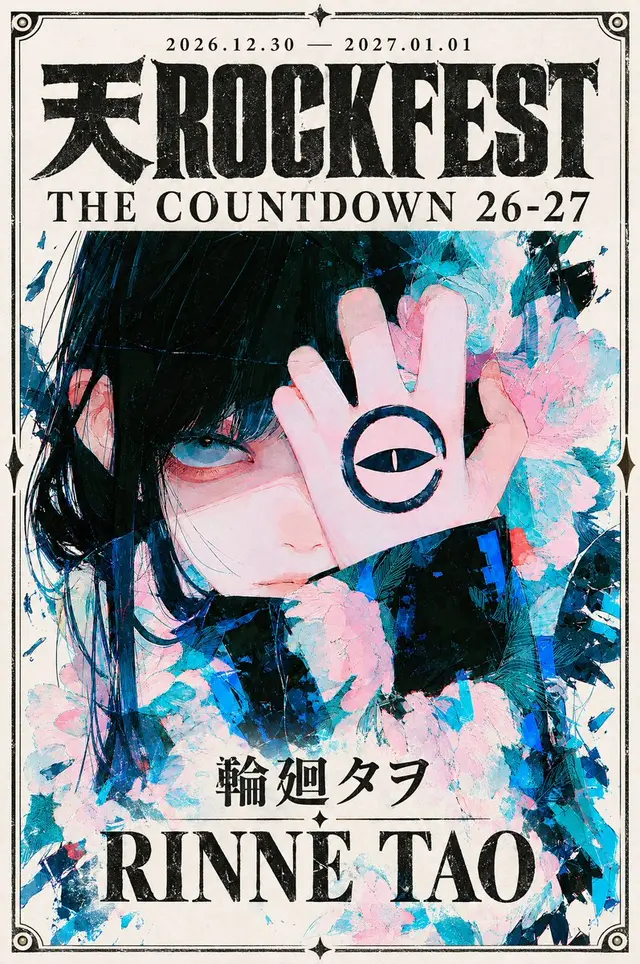
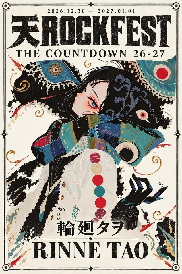
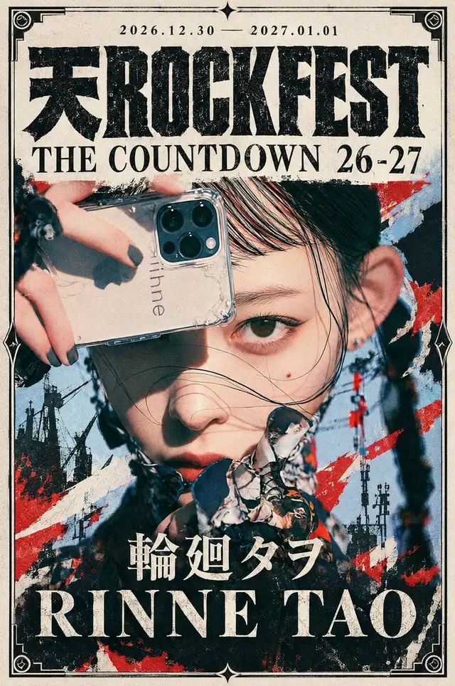
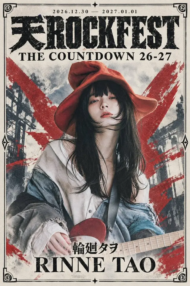
提示词
Create a premium vertical 2:3 artist announcement poster for the Japanese music festival.

Use ONLY the attached illustration as the featured artwork.

━━━━━━━━━━━━━━━━━━━━
ARTIST INFORMATION — EDIT HERE
━━━━━━━━━━━━━━━━━━━━

Japanese Artist Name:
[Japanese Artist Name]

Romanized Artist Name:
[Romanized Artist Name]

These are the only two artist information fields.

Use these exact names throughout the design.
Do not invent, abbreviate, translate, or alter them.

━━━━━━━━━━━━━━━━━━━━
FESTIVAL INFORMATION — FIXED
━━━━━━━━━━━━━━━━━━━━

Festival Logotype:
天ROCKFEST

Festival Subtitle:
THE COUNTDOWN 26-27

Event Date:
2026.12.30 — 2027.01.01

These festival details must remain unchanged.

Create a collectible Japanese underground music poster—not a conventional flyer or an illustration decorated with generic effects.

━━━━━━━━━━━━━━━━━━━━
ARTISTIC VISION
━━━━━━━━━━━━━━━━━━━━

The festival provides order; the artist brings expression.

ORDER × EXPRESSION
PRECISION × IMPERFECTION
TRADITION × REBELLION

Combine the impact of Japanese underground concert merchandise, experimental editorial design, contemporary illustration, and vintage printmaking.

The result should feel mysterious, powerful, sophisticated, unconventional, and artistically uncompromising.

First interpret the attached illustration as an art director.

Examine its subject, composition, linework, colors, shapes, textures, movement, visual rhythm, and emotional atmosphere.

Identify ONE compelling visual concept and build the entire poster around it.

Different illustrations should produce genuinely different compositions while sharing the same festival typography and ornamental frame.

Every element must reinforce the central creative concept.

The festival establishes the structure.
The illustration establishes the artistic world.

━━━━━━━━━━━━━━━━━━━━
ILLUSTRATION PRESERVATION
━━━━━━━━━━━━━━━━━━━━

Treat the attached illustration as an existing finished artwork.

Preserve:

- Character identity and facial features.
- Expression and pose.
- Body proportions.
- Costume and accessories.
- Original drawing technique.
- Linework and brushwork.
- Colors and material textures.
- Important patterns and visual motifs.
- Distinctive compositional details.

Do not redesign the subject, invent objects, alter anatomy, or replace the original artistic style.

Do not reinterpret the illustration as photography or another medium.

Scaling, thoughtful cropping, and peripheral background extension are permitted.

Preserve the artwork's essential visual information and original character.

The illustration must remain recognizable as the original artist's work.

━━━━━━━━━━━━━━━━━━━━
COMPOSITION
━━━━━━━━━━━━━━━━━━━━

Give the illustration a commanding visual presence.

Determine placement, scale, and cropping from its focal points, silhouettes, visual movement, and emotional atmosphere.

Do not force a fixed centered composition or conventional rectangular image panel.

Use bold editorial cropping where appropriate while preserving essential facial features, gestures, and distinctive details.

The illustration should feel naturally integrated into the entire poster.

Allow its shapes, lines, and colors to extend organically into the surrounding graphic environment.

Avoid making the artwork appear like an isolated image pasted onto a decorative background.

FULL-HEIGHT ARTWORK:

Treat the ENTIRE poster as one continuous artwork canvas, including the bottom artist-name area.

Do not stop, shrink, or fade the illustration above a separate typography footer.

Allow the original artwork and its visual extensions to continue beside, around, between, and where appropriate beneath the artist names, reaching toward the bottom frame.

Keep text readable through localized contrast control or naturally quiet areas.

Do not create an empty footer, opaque background panel, or large blank section.

The artwork must remain visually present throughout the entire composition.

━━━━━━━━━━━━━━━━━━━━
ARTWORK-DRIVEN VISUAL EXPRESSION
━━━━━━━━━━━━━━━━━━━━

The background and surrounding graphics must emerge from the illustration's own visual language.

Study its:

- Line quality and brushwork.
- Shapes and silhouettes.
- Color relationships.
- Patterns and textures.
- Directional movement.
- Visual rhythm.
- Emotional atmosphere.

Extend these characteristics into ONE coherent graphic direction.

The illustration's world should appear to expand naturally beyond its original boundaries.

Possible approaches include:

- Extensions of original brushstrokes.
- Organic continuation of existing shapes.
- Enlarged or fragmented visual motifs.
- Artwork-inspired geometric forms.
- Expressive color fields.
- Layered graphic silhouettes.
- Experimental editorial collage.
- Selective screen-print textures.
- Delicate structural curves.
- Asymmetrical abstract compositions.

These are possibilities, not mandatory elements.

Choose only techniques that genuinely strengthen THIS illustration.

Do not automatically add ink splashes, random brushstrokes, celestial symbols, or generic grunge effects.

If the artwork contains expressive brushwork, extend its existing character.

If it uses flat colors or geometric shapes, preserve that graphic simplicity.

If it contains intricate patterns, use selected motifs to create visual continuity.

If it has delicate linework, let that delicacy inform the surrounding design.

The graphic expression must feel like a natural continuation of the artwork, not a separate decoration.

VISUAL ENERGY:

The composition must contain moments of visual intensity.

Create impact through scale, contrast, movement, color, rhythm, and expressive forms.

Concentrate visual energy in selected areas.

Preserve clean, purposeful negative space elsewhere.

Do not distribute detail uniformly.

Do not fill every empty area.

The result must balance expressive energy with editorial sophistication.

Neither timid minimalism nor chaotic collage.

━━━━━━━━━━━━━━━━━━━━
FESTIVAL IDENTITY & COLOR
━━━━━━━━━━━━━━━━━━━━

The festival's core graphic palette:

- Deep black.
- Luminous light ivory.
- Muted crimson.
- Antique gold.

Black and ivory anchor the typography and framing.

Crimson and gold are optional accents.

Let the illustration's original colors influence the surrounding graphic environment.

Do not recolor the artwork to match the festival palette.

Preserve its original color relationships and artistic character.

BACKGROUND SURFACE:

Where exposed, use clean, bright ivory or soft off-white art paper.

Keep paper grain extremely subtle.

Avoid brown or yellow discoloration, heavy aging, stains, smoke, scratches, and dirty-paper effects.

Vintage character should emerge primarily from printed typography and selected ornaments.

Rough printing does not require dirty paper.

Maintain strong contrast between expressive artwork and clean negative space.

━━━━━━━━━━━━━━━━━━━━
FESTIVAL TYPOGRAPHY
━━━━━━━━━━━━━━━━━━━━

DATE — TOP:

Display the Event Date defined in FESTIVAL INFORMATION.

Small, elegant Roman serif typography.
Wide letter spacing.
Centered.
Deep black.

MAIN FESTIVAL LOGOTYPE:

Display the Festival Logotype defined in FESTIVAL INFORMATION.

Use a distinctive ultra-bold slab-serif / condensed gothic hybrid inspired by vintage Japanese underground rock lettering.

TYPEFACE STRUCTURE:

- Tall, vertically emphasized proportions.
- Narrow, balanced character widths.
- Powerful vertical strokes.
- Subtle variations in stroke thickness.
- Sharp, carefully constructed terminals.
- Restrained slab-like or wedge-shaped serif details.
- Distinctive, unconventional letter anatomy.
- Tight but deliberate spacing.

The Latin letters should feel custom-drawn rather than digitally typeset.

Avoid generic Impact-style typography, uniform rectangular blocks, and random glyph distortion.

The Japanese character and Latin letters must integrate seamlessly.

Match their visual height, weight, and typographic character.

Keep the complete logotype on ONE horizontal line.

TYPOGRAPHIC PRECISION:

Construct accurate letter proportions, counters, intersections, terminals, and spacing BEFORE applying distress.

Do not allow heavy strokes to merge accidentally.

The lettering must remain structurally convincing without its printed texture.

PRINT TEXTURE:

Apply controlled uneven ink coverage, stamp-pressed texture, selective dropout, and roughened edges.

Think overinked woodblock print meets industrial stencil.

Characters should feel physically heavy and slightly irregular, NOT clean digital type.

Preserve strong silhouettes and complete legibility.

Intentional roughness, never malformed letters.

LOGOTYPE SCALE:

Keep the logo commanding but slightly reduced in height to provide more space for the featured illustration.

Aim for approximately 86–90% of usable poster width, adjusting naturally for typography.

Do not weaken its visual weight.

FESTIVAL SUBTITLE:

Display the Festival Subtitle defined in FESTIVAL INFORMATION.

Place immediately beneath the logotype.

Use refined, widely spaced UPPERCASE Roman serif typography with elegant thick-to-thin stroke contrast.

The subtitle should be moderately enlarged, prominent, and comfortably legible at social-media size.

Keep it visually lighter than the monumental festival logo.

The contrast between heavy festival lettering and elegant serif typography is essential.

━━━━━━━━━━━━━━━━━━━━
ORNAMENTAL FRAME
━━━━━━━━━━━━━━━━━━━━

Surround the poster with a distinctive custom-designed industrial-print frame.

STRUCTURE:

- Fine double-line border.
- Defined outer line and delicate inner line.
- Ornamental L-shaped corner brackets.
- Layered circular rivet or bolt details at all four corners.
- Elongated diamond connectors at the middle of both sides.
- Precise four-point stars or diamonds at the top and bottom center.

Use intentional line interruptions and restrained printing imperfections.

The frame should feel architectural, sophisticated, and slightly unconventional.

Keep its geometry precise and recognizable across different artist posters.

The frame must remain complete and visually secondary to the illustration and title.

Allow the artwork and its natural graphic extensions to approach or subtly interact with the frame when compositionally appropriate.

The paper continues naturally beyond the border.

━━━━━━━━━━━━━━━━━━━━
EDITORIAL RELATIONSHIPS
━━━━━━━━━━━━━━━━━━━━

Create a clear visual hierarchy:

Festival title — authority and identity.
Illustration — individuality and artistic expression.
Graphic environment — atmosphere and movement.
Artist name — powerful closing statement.

Balance:

- Monumental typography and delicate ornamentation.
- Expressive illustration and structured graphic design.
- Large visual forms and intentional negative space.
- Precise framing and organic artistic movement.

Use asymmetry or symmetry according to the illustration's needs.

Do not mechanically distribute elements.

Every major visual decision should strengthen the relationship between the artist's world and the festival identity.

With no catchcopy, let the artwork itself carry the emotional expression.

━━━━━━━━━━━━━━━━━━━━
ARTIST NAME
━━━━━━━━━━━━━━━━━━━━

Near the bottom, display the Japanese Artist Name defined in ARTIST INFORMATION.

TYPOGRAPHY:

Refined Japanese Mincho.
Medium-to-large size.
Centered with elegant spacing.

Below it, display the Romanized Artist Name defined in ARTIST INFORMATION.

TYPOGRAPHY:

LARGE uppercase Roman serif display typography.

High-contrast strokes.
Sharp terminals.
Confident tracking.
Subtle printed imperfections.

The Romanized artist name should occupy a substantial portion of the available width.

Maintain generous vertical separation between the Japanese and Romanized names.

The artist name should provide a powerful final visual anchor without overpowering the festival logotype.

A fine rule and small diamond may be added if compositionally useful.

IMPORTANT:

The artist names exist WITHIN the continuous artwork.

Do not create a separate empty footer.

Keep the illustration and its visual extensions present around the lettering.

Protect only the immediate text areas where necessary for readability.

Do not shrink or terminate the artwork to accommodate typography.

TEXT ACCURACY:

Use the exact artist names provided in ARTIST INFORMATION.

Preserve the Japanese characters precisely.

Display the Romanized name in uppercase.

Do not alter spelling, invent additional names, or introduce alternative versions.

━━━━━━━━━━━━━━━━━━━━
MATERIAL & PRINT FINISH
━━━━━━━━━━━━━━━━━━━━

Create the tactile sophistication of premium printed concert merchandise.

Use selective:

- Screen-print imperfections.
- Uneven ink coverage.
- Subtle ink dropout.
- Fine paper grain.
- Distressed lettering.
- Ornamental printing irregularities.

The strongest distress belongs to the festival logotype.

Graphic elements may carry expressive printed textures when compatible with the illustration.

The original artwork must retain its drawing style, colors, textures, and details.

Do not apply uniform grunge across the illustration or background.

Do not use distressed textures to conceal inaccurate rendering.

The paper should remain comparatively clean.

The contrast between rough printed elements and luminous paper is part of the design.

━━━━━━━━━━━━━━━━━━━━
CRAFTSMANSHIP
━━━━━━━━━━━━━━━━━━━━

Maintain exceptional precision in:

- Japanese and Latin typography.
- Glyph anatomy and spacing.
- Frame geometry and line intersections.
- Original character design and facial features.
- Hands, gestures, and anatomy.
- Costume details and accessories.
- Fine illustration linework.
- Patterns and visual motifs.
- Transitions between artwork and surrounding graphics.

Avoid malformed ornaments, distorted anatomy, merged letters, and meaningless decorative details.

Preserve the source illustration's craftsmanship.

ARTISTIC ROUGHNESS IS NOT RENDERING CARELESSNESS.

━━━━━━━━━━━━━━━━━━━━
TEXT REQUIREMENTS
━━━━━━━━━━━━━━━━━━━━

Render only:

- The Event Date from FESTIVAL INFORMATION.
- The Festival Logotype from FESTIVAL INFORMATION.
- The Festival Subtitle from FESTIVAL INFORMATION.
- The Japanese Artist Name from ARTIST INFORMATION.
- The Romanized Artist Name from ARTIST INFORMATION.

Each text element must appear only once.

Preserve exact spelling and capitalization.

No catchcopy, slogans, additional text, or "COUNTDOWN LIVE".

Do not display December 31 separately.

━━━━━━━━━━━━━━━━━━━━
FINAL CREATIVE OBJECTIVE
━━━━━━━━━━━━━━━━━━━━

Create a visually unforgettable Japanese underground music festival poster.

The illustration must remain authentic, compelling, and dominant.

The surrounding graphic design must emerge from the illustration's own artistic language.

The festival typography and ornamental frame establish the recognizable identity.

The entire composition, including the artist-name area, is one continuous visual world.

Not an illustration decorated with random effects.
Not an illustration placed on an empty background.
Not a generic rock concert flyer.

A sophisticated illustrated artwork.
A collectible underground music poster.
A singular visual statement.

If the design feels too restrained, strengthen the artwork's existing expressive language rather than adding unrelated ornaments.

If it feels cluttered, simplify secondary graphics without weakening the main visual idea.

Every element must feel intentional and connected.

The structure belongs to the festival.
The expression belongs to the artist.
The completed design belongs to both.

Output the finished poster only.
 桃子AI画廊Tao Image Gallery