译文
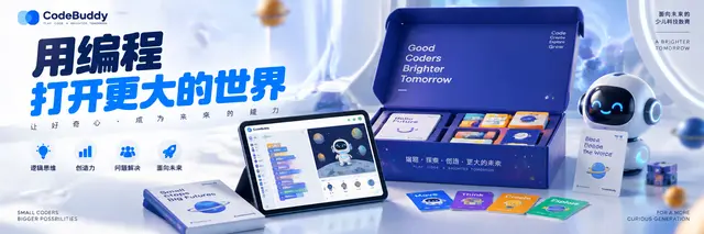
【Brand Positioning】This is not a course poster, but a children's science and technology education campaign centered around "Future Enlightenment." The product must be in an active state of "being opened/being explored," establishing a dual resonance of parent trust and child curiosity. The image needs to present: a top-tier educational technology group's creative team × Children's Aesthetics Laboratory co-branded quality. Viewers should immediately understand: programming, fun, professional, future.

【Visual Composition】The Experience Gift Pack (gift box/tablet/programming card set) as the absolute visual core, occupying about 40% of the image. The product can stand firmly on a light-colored surface or slightly float. If there are children's elements, they are limited to the tablet screen's light reflection or arm局部 (absolutely no full hand and finger details). The screen displays the real programming interface (block-based code/animation characters). The gift box surface has real material textures and a sense of unboxing ceremony. Surrounding are micro-technology elements (circuit board textures, binary particles, geometric light points). All elements are constructed around the brand's exclusive color palette.

【Background Design】Brand exclusive light gradient background, not a chaotic classroom scene, pure advertising-grade educational studio setting. The foreground has a soft blur of technology particles (light points, floating geometry, soft data lines) to create depth of field. Commercial-grade soft light bloom, subtle light spots floating in the air, high-end matte/mirror reflection.

【Product Presentation】The real experience gift pack itself, packaging/screen perfectly visible, material ultra sharp, microscopic details clear (box textures, screen pixels, printing technology), real material reflection, high-end commercial retouching.

【Copy Level and Font System】Top left: brand official logo, presented in a small size with exquisite detail, main title in ultra-bold rounded sans-serif (referencing the friendly power of children's science and technology brands), letter spacing -3% compact arrangement, occupying the upper visual focus of the image, color extracted from the brand's main color. Subtitle: medium weight sans-serif, letter spacing +10% spacious arrangement, creating a sense of professional trust. Right/bottom benefit points: minimalist icon system, small size rounded font, 4-6 characters per line, like ability tag font clean, high readability, not overshadowing the product.

【Flat System】Apple-level minimalist, LeGe-level fun confidence, educational technology-level product communication. Strong visual hierarchy, perfect negative space, children's science and technology layout, mobile-first readability, all elements aligned with professional advertising grid.

【Light and Shadow System】High-end educational commercial soft light, top-mounted large soft light box, product edge premium contour light, controlled mirror highlights, natural soft shadows, product soft glow.

【Camera Parameters】Hasselblad H6D-400C, 85mm lens, f/4, ISO 100, studio commercial photography, ultra-sharp focusing, professional advertising retouching.

【Emotional Tone】Future, fun, professional, trustworthy, enlightening, exploring.

【Technical Constraints】no human hands, no fingers, no palms, photorealistic product packaging, accurate screen display with block-based coding interface, authentic material textures, soft tech particles in foreground, professional advertising retouching.

【Final Effect】World-class children's science and technology education advertising poster, presenting real global educational product_campaign quality, blending hyper-realistic product photography, science and technology education aesthetics, luxury commercial lighting, high-end graphic design, strong brand recognition, perfect font hierarchy, and high-conversion social media aesthetics.
 桃子AI画廊Tao Image Gallery