译文
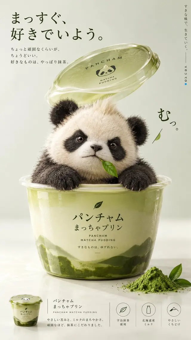
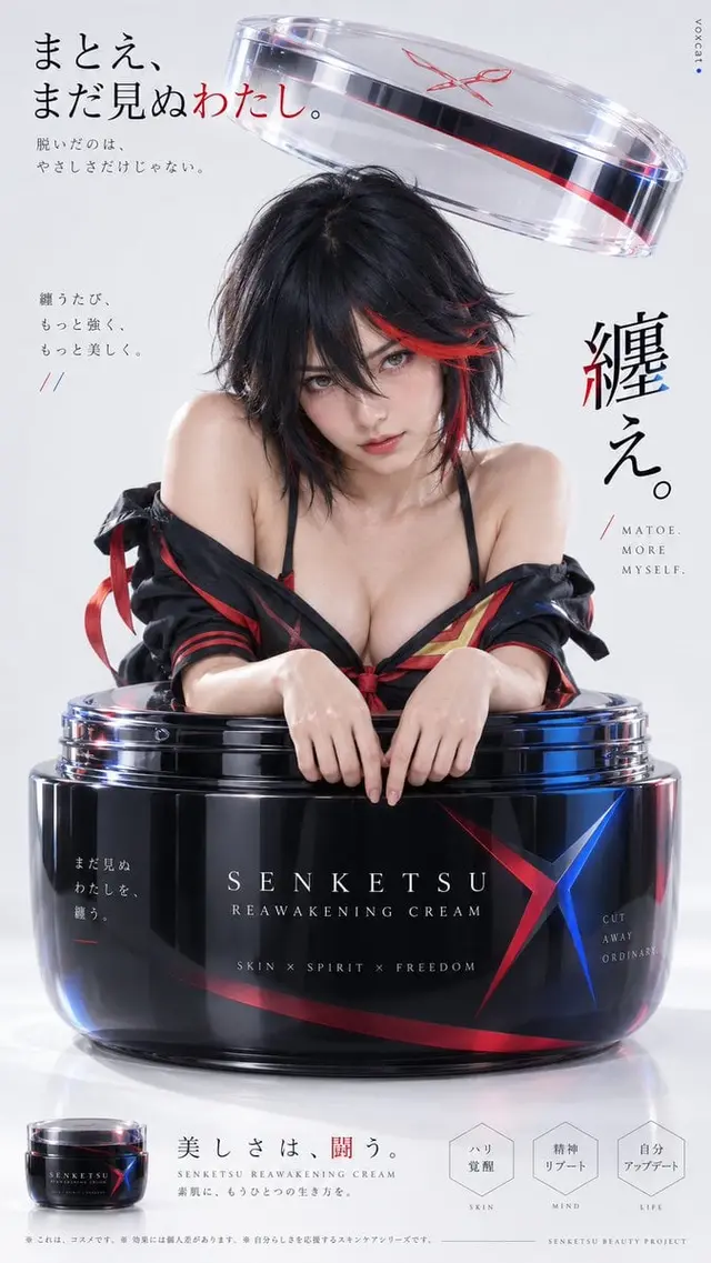
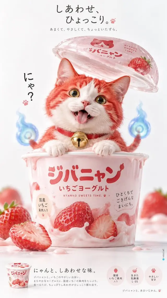
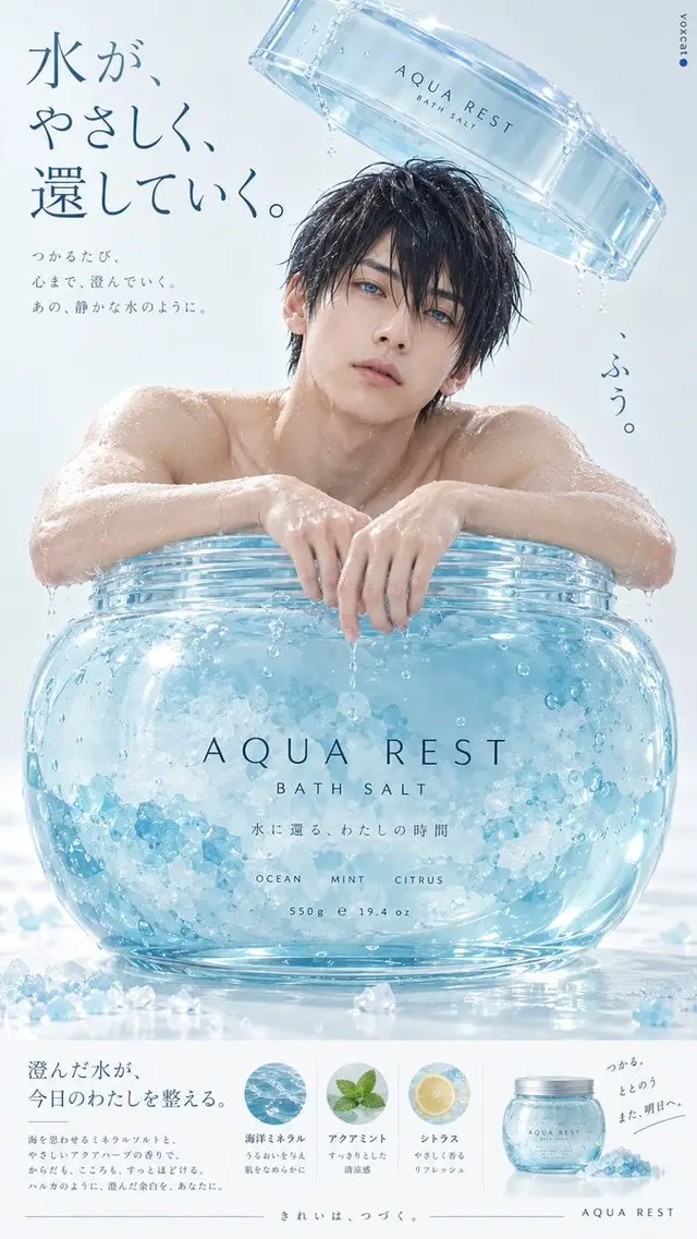
[Character], retaining the most core identity features: facial structure, hairstyle, hair color, eye color, iconic accessories, identity symbols, and main colors. Naturally reconstruct the character form, with human characters presented as realistic adult images and animal characters retaining their realistic animal forms.

Japanese minimalist advertising × high-key studio photography × soft pastel product styling × playful surrealism × premium Japanese commercial art direction.

9:16 vertical format Japanese minimalist commercial photography poster, with a prominently enlarged [product/container] placed in the center of the image. The character naturally protrudes the upper body from inside the container, with hands or front paws relaxedly resting on the front edge of the container, the head positioned above the container, facing the camera, revealing a curious, slightly clumsy natural expression. The container has a rounded, smooth outline and a realistic product packaging structure, creating an interesting proportion contrast with the character.

The lid of the container floats above the character's head, depicting the moment it has just been opened. The lid is slightly tilted, with a realistic thickness, transparency, refraction, and soft reflection, creating an interesting spatial hierarchy with the character's head.

The product color is chosen independently based on the character's main color and temperament, with a visual center composed of soft cream colors, pastel colors, or low saturation, refreshing colors. The background uses a seamless studio backdrop in extremely light gray, milk white, or light gray green that coordinates with the subject.

Large areas of high-key diffused lighting, soft contact with shadows, delicate and natural textures of hair, skin, plastic, and transparent materials, controlling local contrasts, and retaining realistic micro-textures. The overall tone is light, bright, and soft, using a subtle color temperature contrast between a cold white background and warm-colored products.

Composition emphasizes the complete product outline, the character's facial expression, and large areas of negative space. A small amount of Japanese advertising titles are arranged at the top, a short, eye-catching keyword is arranged on the side, and at the bottom, a minimalist product thumbnail, fine text, and geometric information modules form a flat advertising layout. The copy is automatically created based on the character and product.

Ultimately presented as a creative advertising photography for a professional Japanese daily用品 brand, real, quiet, humorous, cute, minimalist, with mature commercial art direction and exquisite graphic design sense. The right edge retains a very small "voxcat" and lapis lazuli blue dot.
 桃子AI画廊Tao Image Gallery