译文
[Theme]
[Brand Name]
[Product / Subject]
[Main Color]
[Auxiliary Material]
[Main Title]
[Composition Direction]
[Aspect Ratio]

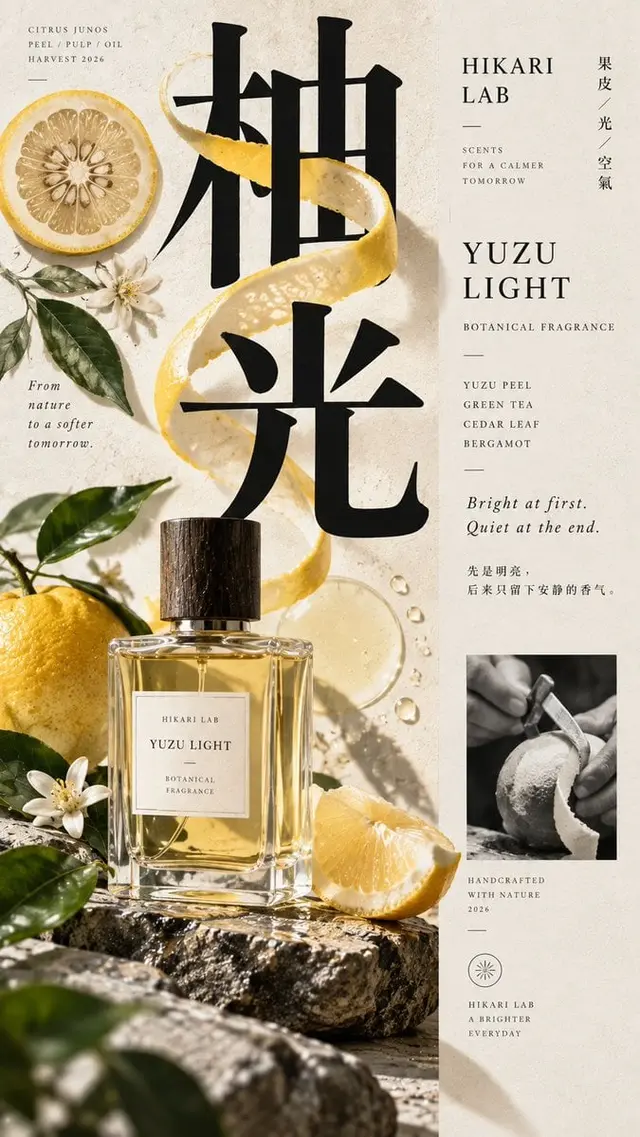
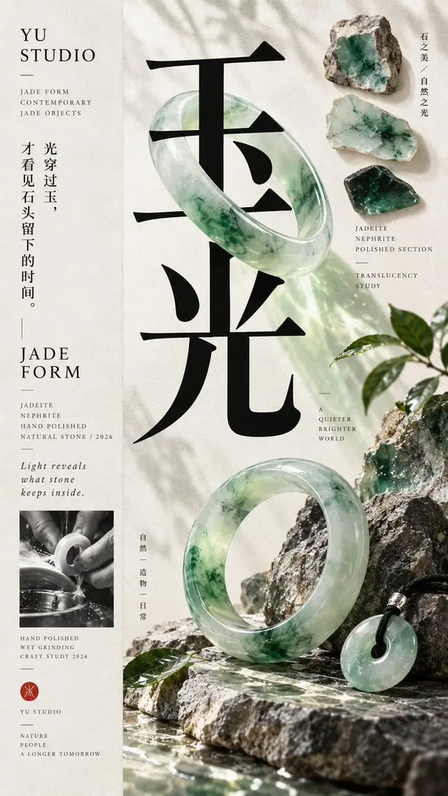
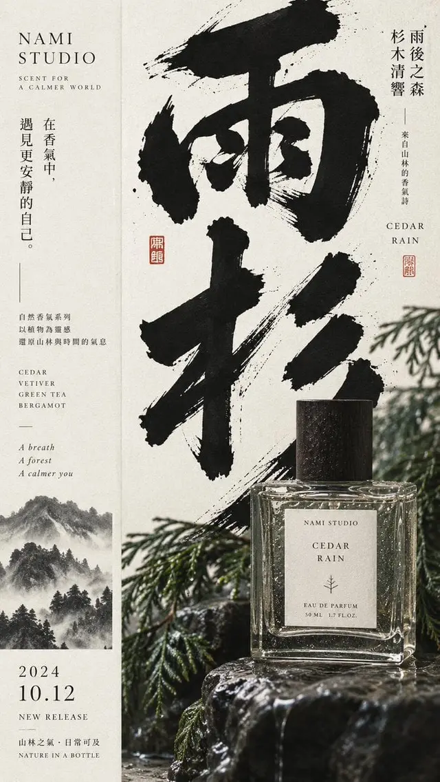
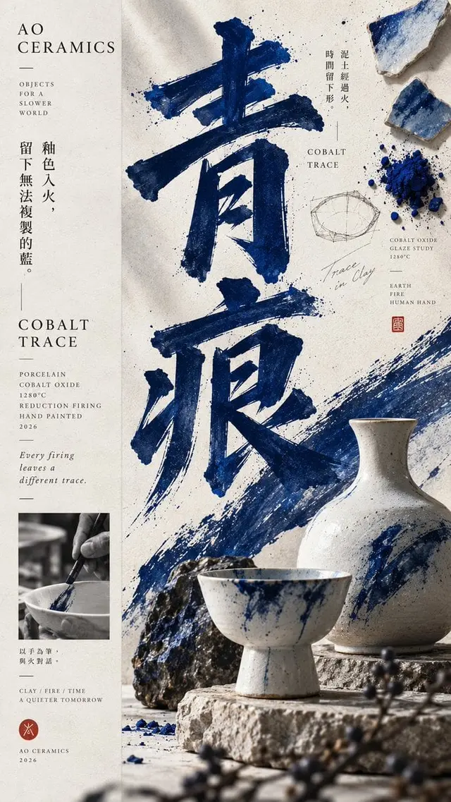
Create a high-end contemporary flat layout poster with a distinct 1:2 oblique composition: approximately 1/3 for a low-density information axis, and approximately 2/3 for a high-density main visual field, which can also be switched between left and right mirroring. Both sides share the same background and visual world, without using obvious borders, hard-cut color blocks, or traditional double-column templates.

The main visual area includes a large Typography anchor point, a real product or core subject, 1-2 auxiliary material elements, a small material study or process sample, and a few dynamic elements that connect text and objects. Let the text, product, and materials have natural occlusion, interweaving, and front-to-back relationships, rather than simply placing images and text side by side.

The huge title must take on the main compositional role, with a font size large enough to remain clear when shrunk; the product or subject as the second visual layer, forming a clear scale difference and spatial interaction with the title. You can add auxiliary information such as raw material slices, process samples, original stones, plants, glaze pieces, process photography, but they must be clearly weaker than the main title and subject, and cannot form a third column or even distribution.

The information axis should be restrained, only placing the brand name, product name, material, craft, year, and one or two lines of real theme copywriting. Avoid lorem ipsum, random text, numbers, copyright information, and meaningless decorative text.

Overall, follow the principle of "big shape and strong at a distance, rich information at close range": at first glance, see the main title, subject, and main color, and only after zooming in do you discover the material, craft, process, and details. Information can be rich, but the visual weight must have clear levels.

Color control within 2-4 core colors, with one main color establishing a memory point; the background clean, with a slight paper or printing texture, but not yellowed, patchy, strong grainy, or aged.

The final image should be between an advanced brand campaign, a contemporary East Asian editorial poster, product photography, and material research manual, with real commercial application value and a complete work sense.

Avoid: central symmetry, even column division, obvious left and right hard cuts, three-column structure, PPT feel, card UI, stacking small images, a large number of decorative elements, meaningless text, excessive aging, cheap e-commerce feel, CGI plastic materials, excessive sharpening, starbursts, numbers, watermarks, and copyright identifiers.
 桃子AI画廊Tao Image Gallery