译文
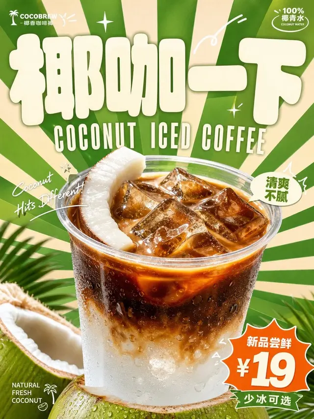
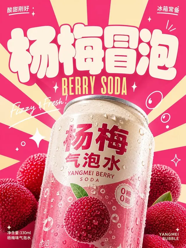
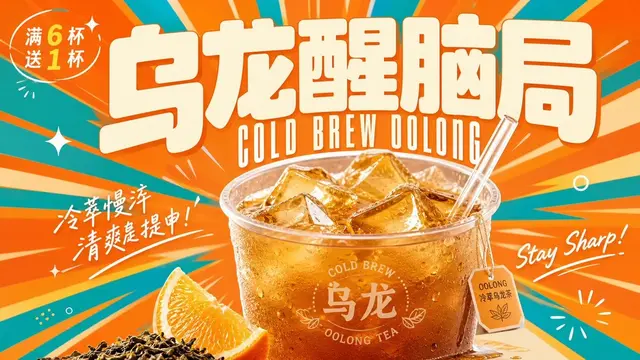
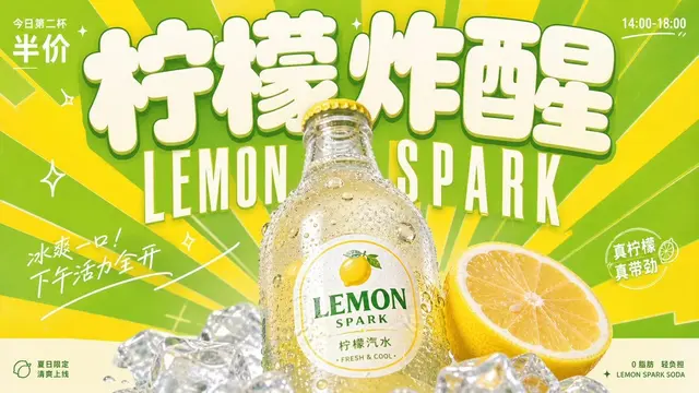
Create a bright and cheerful retro commercial advertisement visual centered around a specific beverage theme: The first thing that catches the eye is a super-large, sturdy, rounded-off, full-bodied theme logo that establishes a memorable point, with a font that resembles soft, inflated sign blocks, with light fill and clean edges, dominating the upper visual focus; the main beverage form appears in the lower center with a realistic product photography texture, close-up and magnified, with clear highlights, condensation or liquid sheen, and natural shadows, covering the background and part of the text, creating a strong sense of depth between flat graphics and real products. The background uses radiating blocks spreading out from the subject, with sharp edges and dense rhythm, creating a sense of speed and joyful impact. The text system is divided into three layers: the main logo is the largest, the subtitle uses narrow, high, retro uppercase letters just below it, small-sized information is scattered at the corners, handwritten italic short sentences pass through the subject surrounding it in curves or diagonals, and a few white line-drawn arcs, flash symbols, and small marks are added to enhance the rhythm. Colors are extracted from the flavor, material, and brand emotion of the beverage, retaining large areas of clear structural colors, a few strong contrasting colors, light information text, and warm main color roles; the overall is high lightness, high saturation but clean and airy, with clear color gradients, a fresh, playful, and energetic mood, avoiding dark, dirty, and low-vitality retro grain and murky layers.

——————
Aspect Ratio: Vertical 3:4, suitable for mall beverage flash stand signs
Main Subject: [Main Subject]
On-site Text: Main logo " [Main Logo]", subtitle " [English Subtitle]", corner small text " [Corner Small Text]"
Impression on Passersby: [Mood Description of the Image]
 桃子AI画廊Tao Image Gallery