译文
Create a set of high-quality, unified visual system "original fresh fruit e-commerce brand commercialization proposal / 4-Board Fresh Fruit Brand Commercialization Proposal" based on the following settings.

Note: This is not a four-panel layout, nor is it a single image combining 4 contents. Instead, it consists of 4 independent images under the same brand system, which need to be generated sequentially. Generate only the current image at a time, and automatically continue the brand visual DNA established so far until all 4 images are completed. The aspect ratio of all images is vertical 3:4.

【Brand Setting】
Brand Name: 枝上初红
English Auxiliary Name: FIRST RED ON THE BRANCH
Brand Type: High-end Fresh Waxberry E-commerce Brand / Summer Fresh Fruit Brand / Light Gift Fresh Fruit Brand
One-sentence Positioning: Bring the first mouth of summer from the mountains to your hands.
Core Keywords: Waxberry Season, Freshly Picked, Direct From Origin, Cold Chain Preservation, Sweet and Sour, Mountainous Feel, Summer Fruit Gift, E-commerce Commoditization
Target Audience: Urban families, young white-collar workers, consumers who pay attention to quality and seasonal sense, light gift users, e-commerce fruit consumers
Overall Style: Summer Fresh Fruit E-commerce Aesthetics × Advanced Realistic Product Photography × Light Fruit Gift Brand Proposal
Main Color: Waxberry Deep Red, Fresh Fruit Red Purple
Auxiliary Color: Leaf Green, Milk White, Ice White, Light Gray Blue
Accents: Dewdrop Silver Gray, A Little Micro-Metal Light Gold
Visual Elements: Waxberry Grain Texture, Branches, Fruit Stalks, Mountain Line Sketch, Morning Dew, Water Droplets, Ice Feel, Orchard Aroma, Cold Chain Preservation Symbol, Summer Refreshing Atmosphere
Brand Slogan: Bring the first mouth of summer from the mountains to your hands.

【IP Setting】
A light IP is required, not just a logo. The IP name is "枝枝灵 / ZHI ZHI SPIRIT".
It is not a big-eyed cartoon waxberry person, but a克制, cute, light anthropomorphic brand fruit spirit identification object, which can be expressed as a small badge, small tag, small pendant, small sticker, small seal, or packaging guardian spirit. It should have the temperament of waxberries, leaves, and branches, light and cute but not childish, not cheap, not overshadowing the main product, and should naturally integrate into the brand system and product system.

【Product Line / SKU】
1. Sample Pack: 250g
2. Light Enjoy Pack: 500g
3. Family Pack: 1kg
4. Selected Gift Box Pack: 2kg
5. High-end Fruit Gift Pack: Premium Gift Box Version
Complementary Content: Fruit box tray, absorbent pad, ice pack, cold chain insulation bag, courier outer box, handbag, brand card, orchard introduction card, eating suggestion card, seal, sticker, tag, grade label

【Overall Requirements】
1. The four images must clearly belong to the same brand system, with brand name, color, font temperament, graphic language, IP image, packaging logic, and product tone all unified.
2. It is not a common fruit poster or a cheap promotional image, but a set of fresh fruit e-commerce brand system proposal that can be sold, spread, and reused.
3. The images must be very realistic, with real fresh fruit texture, real packaging material texture, real product photography sense, and real cold chain and e-commerce scene sense.
4. The text should be as accurate as possible, with the brand name "枝上初红", English "FIRST RED ON THE BRANCH", and IP name "枝枝灵" clearly and correctly, without code errors, and without long paragraphs of meaningless small text.
5. The IP must exist, but it should be light, not cartoonish, and not like a children's snack packaging.
6. The overall should be transparent, bright, fresh, juicy, summery, and at the same time have brand proposal and commercial sense.

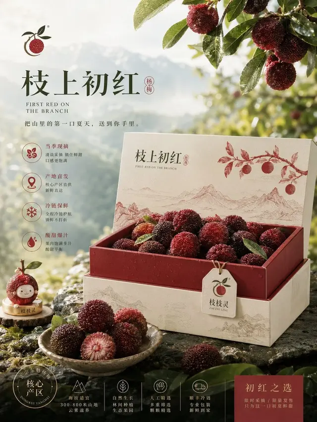
【Image 1: Brand Hero Board】
This image is responsible for setting the tone and is the first visual memory point.
Key Display:
- Brand name "枝上初红"
- English auxiliary name "FIRST RED ON THE BRANCH"
- Brand slogan
- High-end fresh waxberry main packaging or gift box main visual
- Full, fresh, deep red, grainy, dewdrop-real waxberry close-up
- Branches, fruit stalks, mountainous morning, light mist, water droplets, and other atmosphere elements
- Light IP "枝枝灵" appearing as a badge, tag, small ornament, or brand identification object
- Core selling points: Freshly Picked, Direct From Origin, Cold Chain Preservation, Sweet and Sour
Requirement: More like a cover image / Hero Image, not like an instruction manual; has a sense of trending, freshness, seniority, and first-eye appetite.

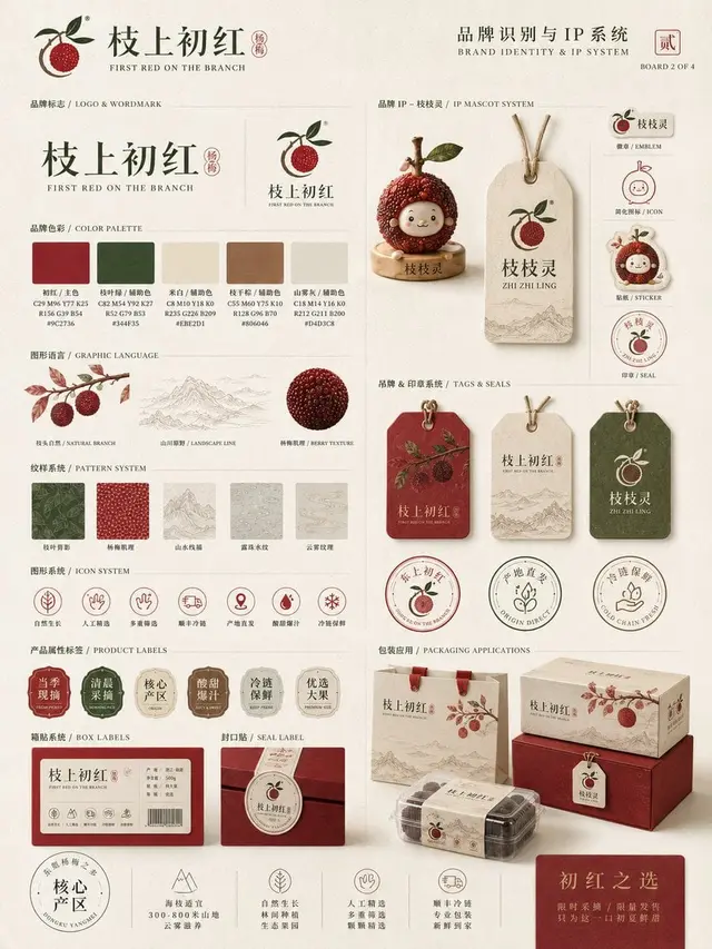
【Image 2: Identity & IP System Board】
This image is responsible for explaining how the brand visual system and IP language are constructed.
Key Display:
- Brand logo / Logo
- Brand color system
- Waxberry grain texture, branches, fruit stalks, mountain line sketch, water droplets, ice feel graphics, and other auxiliary visual language
- Light IP "枝枝灵" system: IP image, small badge, small pendant, sticker, tag, seal, simplified icon
- Specification label system
- Sweetness / Fruit Diameter / Freshness / Cold Chain Icon System
- Small application system: labels, stickers, seals, tags, cards
Requirement: Like an advanced brand identification proposal board, but not stiff, not childish; modular, complete information, with design sense and unity.

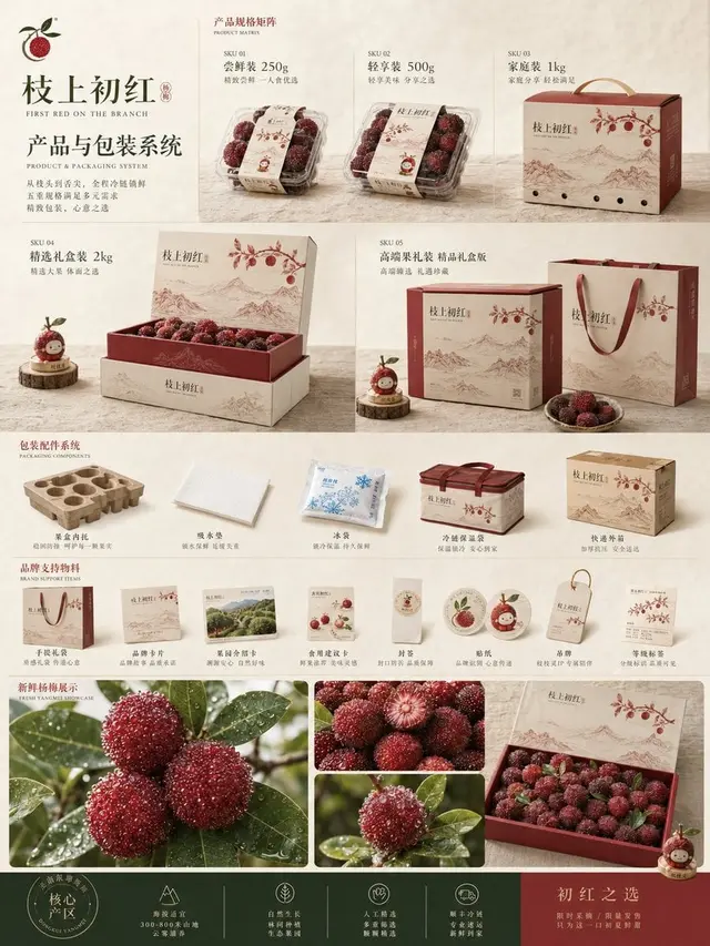
【Image 3: Product & Packaging System Board】
This image is responsible for showing how the brand is implemented in real products and packaging systems.
Key Display:
- 250g, 500g, 1kg, 2kg, premium fruit gift pack product matrix
- Fresh fruit packaging box, gift box, inner tray, absorbent pad, ice pack, insulation bag, handbag, brand card, orchard introduction card, eating suggestion card
- Seal, label, tag, grade sticker
- Fresh fruit close-up, fruit diameter grading or quality expression
- Light IP "枝枝灵" naturally integrated into the packaging system
Requirement: Like a real fresh fruit e-commerce brand product system that can be put on shelves, not just a pile of boxes; it can be seen that there are specifications, packaging logic, and brand unity.

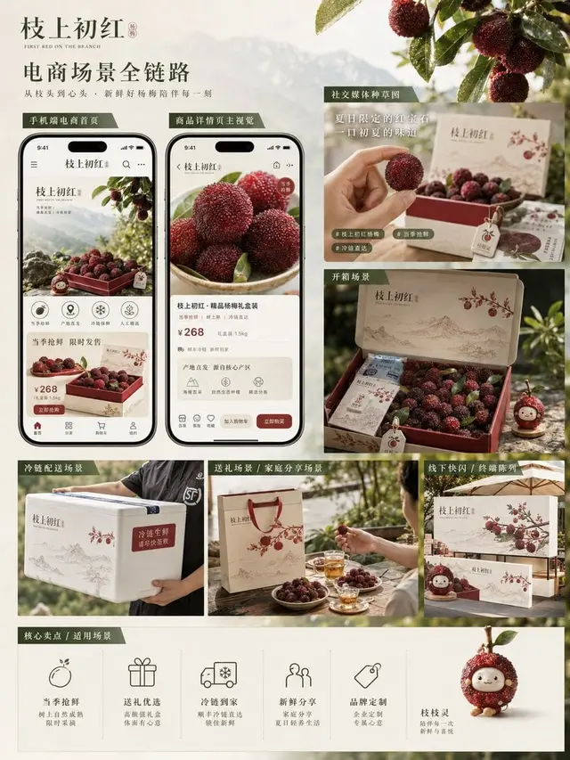
【Image 4: Campaign & Sales Scenario Board】
This image is responsible for showing the effect of the brand entering real e-commerce and communication scenes.
Key Display:
- Mobile e-commerce homepage / product detail page main visual
- Social media trending sketch / feed style communication image
- Unboxing scene: opening the fresh fruit box, seeing the waxberries, ice pack, card, etc.
- Cold chain delivery scene: outer box, delivery, unboxing at home
- Gift scene / family sharing scene / summer afternoon tea scene
- Optional pop-up store / counter / display stand small scene
- Brand color, packaging, IP symbols, and product system remain unified in different scenes
Requirement: More emphasis on real sales and communication scenes than Image 3, not just simple packaging display, but a complete e-commerce chain and brand application effect.

【Negative Requirements】
Do not use a four-panel layout, do not combine the 4 images into one.
Do not have a cheap fruit promotion poster feel.
Do not have a low-quality e-commerce template feel.
Do not have a collage material feel.
Do not have an overly traditional specialty product feel.
Do not make the IP into a big-eyed cartoon waxberry person.
Do not be childish, youthful, or cheap.
Do not have a false CG posed feel.
Do not copy any existing brand or existing IP.

【Execution Method】
Please unify the brand visual DNA of "枝上初红" first, and then generate in order:
Image 1: Brand Hero Board
Image 2: Identity & IP System Board
Image 3: Product & Packaging System Board
Image 4: Campaign & Sales Scenario Board
Generate only the current image at a time, and automatically continue the brand system established so far until all 4 images are completed.
 桃子AI画廊Tao Image Gallery