译文
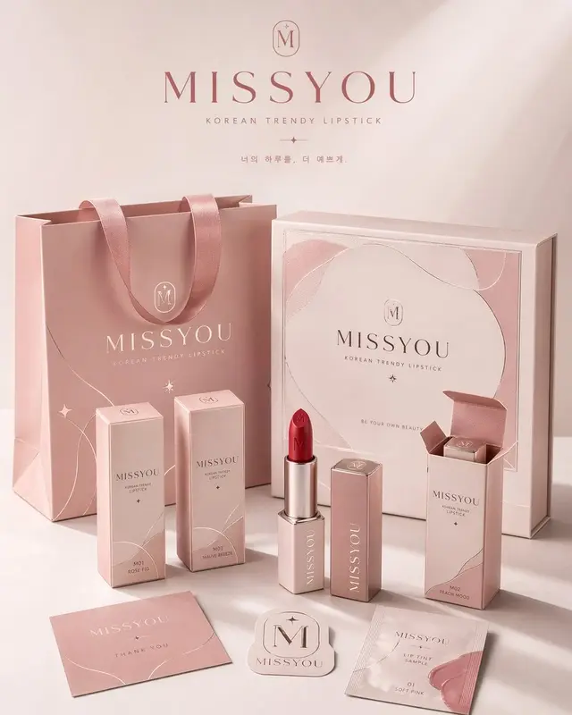
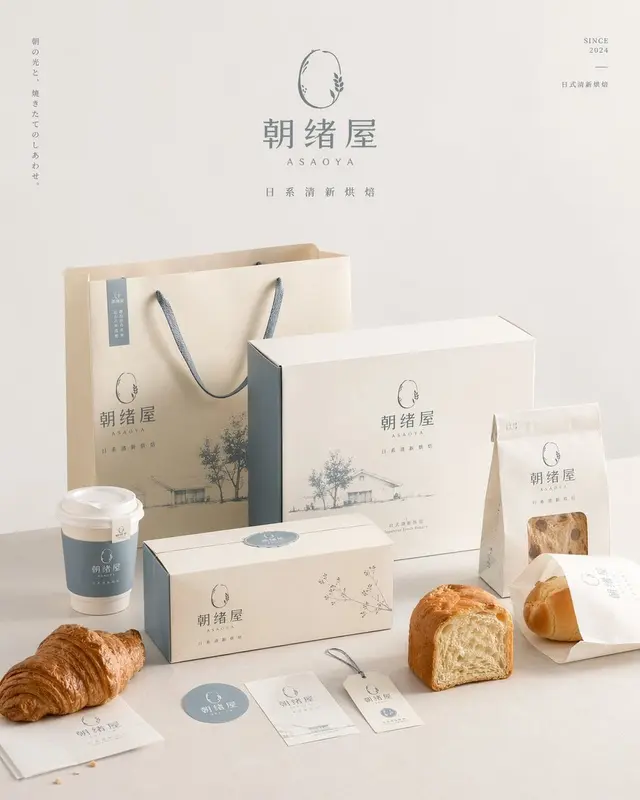
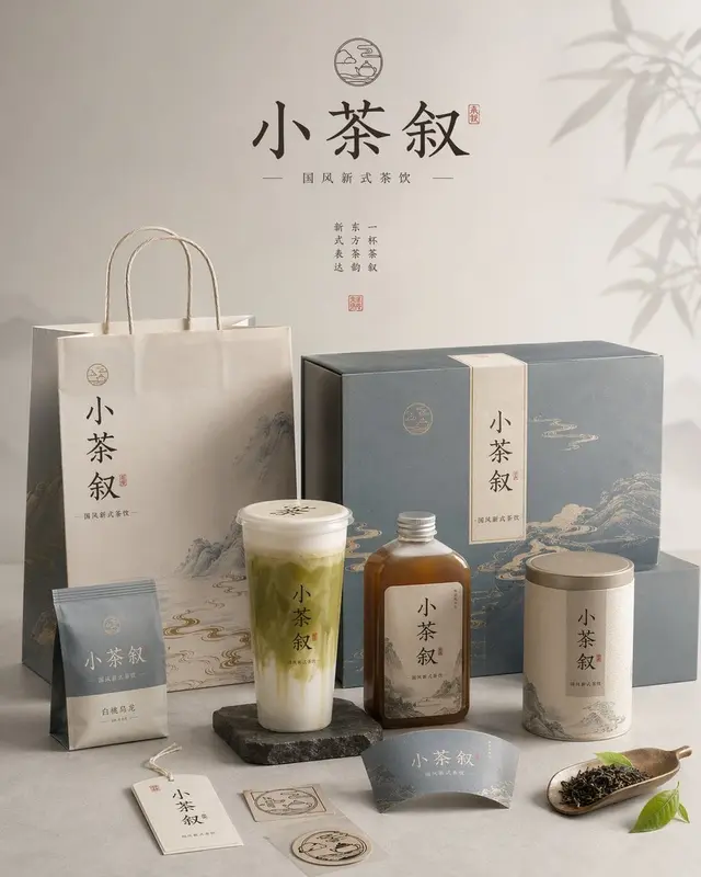
Create a high-aesthetic, high-completion "brand packaging system display image" for [Brand Name], categorized as [Brand Category]. This is not a common e-commerce white background image or a single product image, but an image with a sense of brand proposal, visual identification system, and commercial photography quality. The image needs to reflect "the unified landing of the same brand on multiple packaging carriers," presenting a complete packaging system of a mature consumer brand.

[Composition Requirements] The overall composition must be a fixed vertical poster with a 4:5 aspect ratio. The image direction must be vertical, and horizontal compositions, wide desktop displays, or overly scattered horizontal displays are prohibited. The overall composition must conform to the logic of poster reading: reserve breathing space at the top, focus on the brand packaging system in the middle, arrange auxiliary packaging, labels, and product bodies at the bottom, concentrate the overall weight, and be suitable for direct release as a brand display poster.

[Core Requirements] Automatically match the most reasonable and natural packaging combination and product form according to the [Category], and establish a unified brand visual system around [Brand Name]. The image should select a small number of representative packaging forms to form a complete and concise brand packaging system, not pursuing the number of stacking, but emphasizing the main and secondary levels, brand unity, and display beauty. You can reasonably choose a part of the following packaging types according to the category: tote bags / shopping bags, paper boxes / gift boxes / outer packaging boxes, long boxes / single product boxes / set boxes, packaging bags / covers / sample bags / soft bags, cups / bottles / cans / tube containers / spray bottles / pump bottles, labels / stickers / seals / hangtags / small cards, and the real product body corresponding to the category.

[Category Matching Logic] The packaging form and product form need to be automatically matched according to the [Category], but not limited to a single direction. You can freely diverge according to the following matching logic: if the category is food / baking / snacks / beverages, then paper bags, paper boxes, packaging bags, cups, food containers, stickers, seals, and real product bodies are mainly used; if the category is tea drinks / coffee / beverages, then cups, bottles, canned packaging, tote bags, cup sleeves, sealing strips, gift boxes, etc. are mainly used; if the category is beauty / skincare / cosmetics / perfume, then bottles, cans, tubes, boxes, gift boxes, tote bags, sample packaging, etc. are mainly used; if the category is fragrance / home / lifestyle, then aromatherapy bottles, candle cups, packaging boxes, gift boxes, tote bags, hang cards, label cards, etc. are mainly used; if the category is clothing / accessories / toys / cultural and creative products, then packaging boxes, drawer boxes, dust bags, tote bags, stickers, hangtags, accessory packaging, etc. are mainly used; if the category is digital accessories / tools / small consumer goods, then hard boxes, outer packaging boxes, storage bags, instruction cards, stickers, covers, labels, etc. are mainly used. The overall must reflect the effect of "category rationality, brand unity, and packaging system."

[Quantity and Density Control] Control the number of objects in the image, do not stack too much, and do not show all possible packaging forms. The overall should present a "few but refined, complete but not crowded" brand packaging system effect. It is recommended to choose the most representative packaging carriers for display: 1-2 large packaging, 2-3 medium packaging, 2-4 small packaging or auxiliary objects, 1-3 real product bodies, and the total visible elements are recommended to be controlled between 6-10. The packaging types should reflect the level changes and system sense, but should not repeat too many similar objects. The image should have enough blank space and breathing space to ensure that each packaging is clearly visible, the main and secondary are clear, and the layout is relaxed. It is better to be less but refined than to overfill for the sake of "completeness."

[Brand Visual System Requirements] All packaging must belong to the same brand system and use [Brand Name] as the core brand identification element. The overall should have a consistent logo / emblem presentation, font style, graphic language, illustration language or pattern system, layout logic, color matching system, material and printing texture. The brand tone, color direction, pattern elements, auxiliary graphics, and visual atmosphere should be automatically matched and reasonably diverged according to the [Category], not limited to any fixed style. The overall style should be unified, coordinated, and have brand recognition, which can be simple and sophisticated, natural and organic, fashionable and modern, light luxury and delicate, young and fresh, artistic, trendy and personal, or classic and elegant, but must conform to the characteristics of the [Category] and present the design completion degree of a mature brand.

[Color Matching Requirements] The overall color matching should not be fixed to a certain fixed combination, nor should it repeatedly appear highly similar main color systems. Each time it is generated, a different main color scheme and color relationship should be actively formed according to the [Category] and brand temperament, using the "controlled divergence" method for color interpretation. The color can be low saturation natural color, modern neutral color, light retro color, bright and fresh color, light luxury dark color, or artistic color system, but must maintain a high level, unity, restraint, and brand sense. It is allowed to present different visual temperaments each time, such as cream white and caramel brown, mist gray blue and warm white, olive green and linen beige, wine red and milk cream white, cocoa brown and ivory white, charcoal gray and wheat straw gold, mist pink gray and milky white, navy blue and warm gray, etc., only as reference directions rather than fixed templates. Do not use fluorescent colors, do not use cheap high saturation, and do not use chaotic and uncontrollable multi-color collage.

[Composition and Display Requirements] The image adopts the brand packaging family display logic, rather than chaotic stacking. The overall is a commercial photography studio scene, using a 3/4 light俯视角 or slightly perspective frontal display angle, forming a layered, orderly, and prioritized packaging display image. The composition refers to the following logic: place 1-2 larger packaging in the background as visual support, such as tote bags, large gift boxes, large outer boxes; arrange the core packaging or main product packaging in the middle as the main visual focus; place smaller packaging, auxiliary packaging, labels, stickers, and real product bodies in the foreground; at least one real product should interact naturally with the packaging, such as the product half-exposed, placed in front of the packaging, or combined with the packaging for display; the overall forms a balanced and designed triangular or staggered composition. The image should be clean, have blank space, and not crowded, rich in content but controlled, and reflect a complete brand packaging ecosystem with a limited and accurate packaging combination.

[Visual Style Requirements] The overall presents a high-end commercial photography quality and brand proposal sense, with a clean photography studio background, which can be white, warm white, light gray, or automatically matched according to the brand tone. The image should emphasize the realistic packaging material expression, clear paper creases, box structure, bottle and can contours, label details, printing texture, embossing / hot stamping / matte / cotton paper texture / kraft paper texture, and a unified and high-level color matching, delicate modern and clean brand visual language, and a strong sense of "this is a complete set of brand packaging system."

[Light and Shadow Requirements] Use real commercial photography-level light and shadow, which can be soft studio lighting or slightly directional natural side lighting. There should be clear but controlled shadows to enhance the sense of three-dimensionality, space, and seniority. The overall light should be transparent, bright, and clean, not dark, not cheap, and not chaotic background.

[Final Effect Requirements] The final image should be like a packaging system display poster, packaging family proposal image, or brand visual landing effect image of a mature brand, rather than a scattered product collage. The focus should be on the fixed 4:5 vertical poster sense, brand unity, packaging family integrity, commercial photography sense, design proposal sense, category adaptability, and high-level aesthetics and visual completion.
 桃子AI画廊Tao Image Gallery