译文
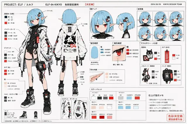
Use the reference image as the basis for character design and draw "a professional character color setting document used in the commercial anime production field."

Maintain the character's face, hairstyle, hair color, eyes, silhouette, body type, silhouette, costume design, color scheme, and overall impression accurately.

Absolutely do not destroy the character's identity.
Do not redraw as a different character.

This is not a finished illustration.
It is not a poster.
It is not concept art.

The purpose is to provide a color setting document for animators, colorists, finishing artists, and camera operators.

The screen is based on the Japanese anime setting document layout with a white background.

Organize and arrange multiple color setting cuts as document pages.

Include the following:

・Full-body color front view
・Full-body color back view
・Face-up
・Expression variations
・Hair color confirmation
・Eye color confirmation
・Costume color matching confirmation
・Accessories color specification
・Shoe color matching
・Small item color setting
・Partial enlargement
・Color palette column
・Color separation arrows
・Handwritten color specification notes
・Finishing instructions notes

Describe the character in a clean anime painting style with cell animation tuning.

Do not apply heavy strokes.
Prohibit excessive gradients.
Prohibit cinematic lighting.
Prohibit social game-style rendering.
Prohibit excessive effects.

The shadow color is organized and designed simply and legibly, like a color specification document in the anime production field.

The saturation is slightly organized and has a natural color tone like a printed setting document collection.

Naturally add color numbers, simple annotations, arrows, part names, and color separation instructions within the screen.

As document pages, prioritize visibility and structural understanding.

The layout has an atmosphere like a Japanese anime setting document collection from the 1990s to 2000s.

Although the information density is high, it is well-organized and easy to read.

Allow for natural margins on the paper surface.

The entire page should have an atmosphere like a printed and scanned setting document collection.

Naturally add slight paper texture, a slight sense of printing, copy paper feel, and scanning feel.

Prioritize looking like "actual production field documents" rather than finished art works.
 桃子AI画廊Tao Image Gallery