译文
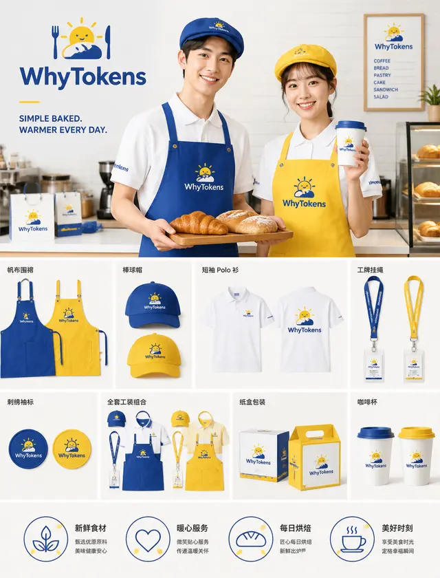
Brand VI industrial layout display board, bakery store WhyTokens full set of visual materials showcase, bright Klein blue + warm yellow contrasting main color, clean ins style commercial brand design main visual: a young East Asian male and female store staff, the boy in blue apron and blue hat, the girl in yellow apron and yellow hat, white short-sleeve Polo shirt, the boy holding a wooden plate with croissants and European bread, the girl holding a brand coffee cup, both smiling in a healing manner; below, modular flat display of the full set of peripherals: canvas apron, baseball cap, short-sleeve Polo shirt, ID card lanyard, embroidered sleeve patch, full set of workwear combination display, brand packaging paper box, coffee cup; upper left corner brand LOGO "WhyTokens", paired with simple sun and baguette bread graphic symbols, auxiliary text slogan: SIMPLE BAKED. WARMER EVERY DAY., bottom 4 service icons + Chinese small text (fresh ingredients, warm service, daily baking, beautiful moments); scene: clean bakery kitchen, white small brick wall, bright and soft indoor soft light, pure white minimalist background; style: commercial brand VI manual effect, flat design cartoon LOGO, embroidered fabric texture realistic, product light and shadow delicate, high-definition commercial photography, clean and bright, healing warm baking atmosphere, layout neat column modular, 8K ultra-clear, brand proposal poster brand
 桃子AI画廊Tao Image Gallery