译文
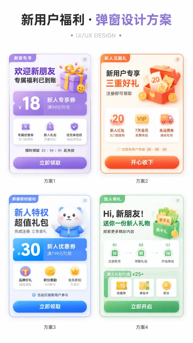
Create a design display image of an APP operation popup with the aspect ratio specified, themed on the given theme.
The background of the image should be pure white, with a clean and simple design proposal style.
The layout is a 2x2 grid, showcasing 4 different popup designs in one image.
All four popups revolve around the same theme, but have different entry points, benefits, icon elements, and information structures.
Add a clear and prominent main title at the top, with a subtitle such as "UI/UX DESIGN" or similar design display text.

The theme can be replaced with: New User Benefits / Version Upgrade / 618 Big Promotion / Membership Opening / Sign-in Rewards / Festival Activities / Invite for Rewards / Time-limited Discounts / Growth Tasks / Points Redemption
The main color scheme can be replaced with: Green Series / Blue-Purple Series / Red-Orange-Gold Series / Black-Gold Series / Pink-Purple Series / Fresh Candy Colors
The style keywords can be replaced with: High Click-Through Rate, Light Skeuomorphism, 3D Cartoon, Soft Candy Texture, Operation Activity Popup, APP Welfare Popup, Gamified Operation Visual, Rounded Card, Soft Shadows, Gradient Buttons

The four sub-plan directions can be replaced with:
1. [Plan 1]
2. [Plan 2]
3. [Plan 3]
4. [Plan 4]

Each popup card must have a realistic APP popup structure, including:
1. Top tag or scene identifier (e.g., "Time-limited Special Offer", "New Customer Exclusive", "Version Benefits", "Upgrade Experience", etc.)
2. Core title area, highlighting the event theme or benefit point
3. Main benefit area, using large numbers, big discounts, and big selling points, such as coupon amounts, discounts, membership prices, upgrade benefits, red packet amounts, task rewards, etc.
4. Auxiliary explanation information, such as usage conditions, time-limited countdown, applicable scope, growth steps, reward content, etc.
5. A clear CTA button, such as "Immediate Claim", "Happy to Receive", "Immediate Opening", "Immediate Update", "Experience Now", "Buy Now", etc.
6. Keep the close button in the upper right corner, enhancing the real UI popup feeling

The four popups need to have a unified visual system, but each small card must have its own changes:
- The copy structure can be different
- Decorative graphics can be different
- Icons can be different
- Benefits can be different
- Component layouts can have slight differences
But the overall still belongs to 4 design schemes under the same theme.

Visually, strengthen the following features:
- White background display, page clean, no complex background
- Vertical design display image, suitable for social media release
- 2x2 layout clear, four cards have sufficient spacing between them
- Popups use rounded cards, soft shadows, and slightly glowing edges
- Large buttons have a strong click feeling
- The overall color is bright, but not messy
- Use a moderate amount of 3D small elements to enhance vitality, such as gift boxes, gold coins, red packets, shopping bags, rockets, crowns, membership cards, treasure chests, bells, whistles, medals, coupons, small auspicious creatures, etc.
- Elements must serve the popup theme, do not distract from the main focus

Layout requirements:
- The top large title is eye-catching, suitable for "series cover"
- The four popups are centered, forming a neat design display board
- Information hierarchy is clear, first see the title, then the four popups
- Each popup should be like a real APP operation interface reference, not just a poster
- Chinese text should be concise and clear, reduce small characters, avoid too much information causing confusion
- Maintain the "AI Visual Proposal Image" texture, suitable for UI/UX inspiration reference, operation activity display, product proposal sharing
 桃子AI画廊Tao Image Gallery