译文
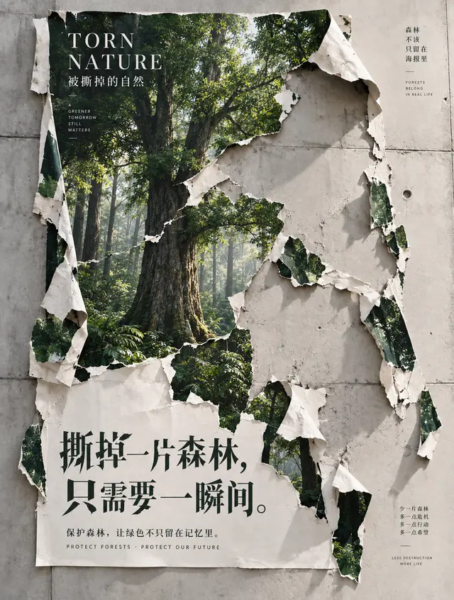
Maintain the original 3:4 composition, torn poster structure, wall position, green forest area, and all text content essentially unchanged, only optimizing texture and font. Focus on optimizing the forest scene in the poster: elevate trees, trunks, branches, and distant forests to a realistic natural photography texture, resembling the raw forests captured in professional ecological documentaries. The trunk structure is realistic and robust, with clear and natural bark textures; the size, density, and growth relationships of the leaves and branches conform to the laws of real plants, avoiding AI-generated repetitive leaves, clumping together, or over-sharpening. The forest has a realistic spatial depth, with clear foreground trees and a natural transition to mid-distance and distant views with slight atmospheric perspective. Sunlight naturally filters through the gaps in the tree canopy, creating soft and realistic forest light, without exaggerating the Tyndall effect or giving a dreamy fairyland feel. Remove all noise and graininess from the image. The wall, paper, and forest should all maintain high-definition, delicate, and clean textures, prohibiting film grain, digital noise, sanding grain, rough dots, over-sharpening, and vintage filters. The tearing of the paper itself should retain the real paper fiber, thickness, curling edges, and natural shadows, but the material should be delicate and clear, without using noise to express texture. The overall effect should reach the level of high-resolution commercial photography and high-end printed poster. Focus on redesigning the two main lines of text below: "Tear off a piece of forest,
in just a moment." Avoid the current common, neat Song typeface layout. Change to a customized Chinese character design with a contemporary art poster feel: a blend of modern Song and sharp Heiti, with elongated and powerful characters, clearly defined rhythm in the stroke thickness, some horizontal and vertical strokes slightly elongated, and fine design of character size and spacing; integrate a very restrained "tear, missing, broken" structure at the edges of a few strokes of the few characters, allowing the font itself to resonate with the concept of "the forest being torn off," but must first ensure the clarity and readability of the Chinese characters. The size, line spacing, and starting position of the two lines of text should form a more dynamic asymmetric editing layout, like the font design in international design exhibitions, art book covers, and high-quality public welfare posters, without calligraphy, brush calligraphy, common computer fonts, or ornate artistic fonts. "Torn Nature / The Torn Nature" and the auxiliary text at the bottom should be optimized for spacing, font size hierarchy, and whitespace, making the entire font system more unified, restrained, and sophisticated. Final effect: realistic ecological photography × torn paper installation art × contemporary graphic design. The image is quiet, has a sense of breathing and design, the forest is realistic and natural, the paper is delicate, and the font becomes the second visual focus. Free of AI feel, noise, grain, over-aging, and cluttered elements. Among them, I think it would be wonderful if the characters **"Tear off a piece of forest"** appeared with slight missing strokes/tears—not adding special effects to the characters, but really making some strokes look like they have been torn off a small part, so that the font design is related to the theme.
 桃子AI画廊Tao Image Gallery