译文
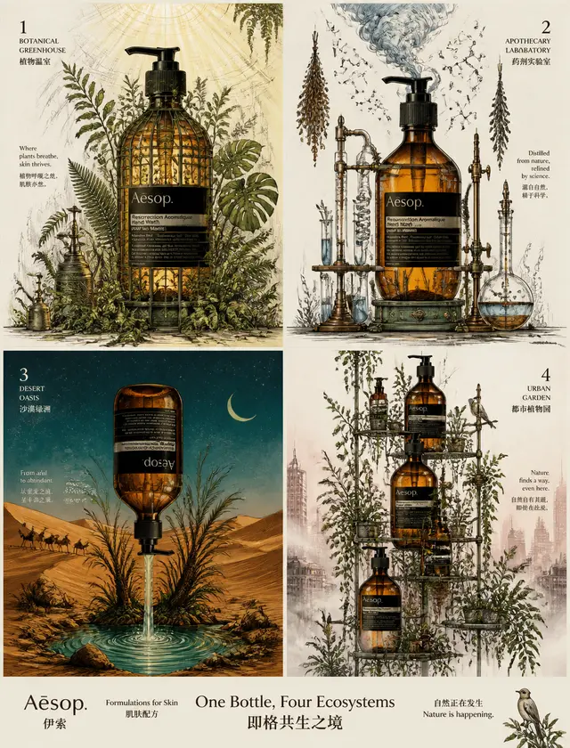
Create a high-end 2x2 grid advertisement poster for Aesop's classic amber glass hand wash liquid. [Layout] 2x2 divided into four panels, square panels, evenly aligned, with a slight gap, and a unified visual rhythm. [Background] Warm beige paper texture with a lot of clean white space. [Style] Delicate black and white hand-drawn graffiti illustrations + real product photography mixed with four independent mood color palettes, high-end lifestyle brand illustration texture. Panel 1 — Botanical Greenhouse (Color Palette: Amber + Moss Green + Warm Gold): The classic Aesop amber glass bottle transforms into a Victorian-style glass greenhouse, with hand-drawn ferns spreading out from the bottle opening, cordyline leaves piercing through the bottle, vines wrapping around the neck, and water droplets twinkling on the leaf tips. The amber bottle glows warmly among the moss green plants, with warm gold sunlight streaming in from above, creating a Tyndall effect. The colors are natural and warm, with a strong plant sense but not cluttered. Panel 2 — Apothecary Lab (Color Palette: Amber + Cobalt Blue + Copper Rust Green): The Aesop amber bottle becomes a retro distillation device, with hand-drawn beakers, condensers, and steam rising from the bottle opening, molecular structures floating in the air, and dried herbs hanging on both sides. The cobalt blue steam contrasts with the amber bottle, and the copper rust green metal支架 is retro and exquisite. The colors are rational and mysterious, with a sophisticated and not cold laboratory feel. Panel 3 — Desert Oasis (Color Palette: Amber + Ocher +孔雀蓝): The Aesop amber bottle is inverted among the sand dunes, with clear spring water and palm seedlings gushing out of the bottle opening, with hand-drawn sand dunes undulating, camel silhouettes walking away, a brilliant starry sky, and a crescent moon hanging. The ocher sand dunes are warm and heavy, the孔雀蓝 night sky is deep and mysterious, and the amber bottle is like liquid amber in the desert. The colors are intense and exotic, high-end but not cheap. Panel 4 — Urban Botanical Garden (Color Palette: Amber + Sage Green + Rose Grey): Multiple Aesop amber bottles are stacked into an aerial ironwork flower架, with hand-drawn morning mist swirling, birds perched on the bottle opening, dew rolling on the leaves, and vines hanging between the bottles. The sage green leaves are soft and elegant, the rose grey morning mist is poetic and hazy, and the amber bottle is faintly visible in the mist. The colors are controlled and high-end, the natural breath of the city. [Product Requirements] The classic Aesop amber glass hand wash liquid bottle is the visual focus of each panel, real, glossy, high-end, easily recognizable, with strong volume, amber glass transparency, clear black label, shadows, highlights, and brand recognition. The amber bottle body + black label is a unified product anchor, participating in interaction in the form of tangible objects such as greenhouses/distillers/oasis spring eyes/airborne flower stands. [Graffiti Requirements] Elegant, controlled, witty, clever composition, clean black ink lines, delicate cartoon minimalist style, soft humor, subtle visual storytelling, and巧妙ly integrated with the product without sticking. The graffiti lines maintain black unity, but the internal filling color and accent color of each panel are executed according to the independent color palette, delicate and not rough, maintaining the high-end sense of the lifestyle brand. [Color Rules] - Each panel has an independent mood color palette (3 colors), deeply bound to the theme - Amber bottle + black label + black graffiti lines are the global unified anchor - Rich colors but not cluttered, each panel has a clear main color + auxiliary color + accent color - Prohibit bright fluorescence, illogical rainbow color stacking, and destruction of high-end sense - The color direction is natural, pharmaceutical, exotic, and urban, each with its own character [Font Layout] Mixed Chinese and English, editing sense, lightness, and high-end: "Aesop" / "伊索" / "Formulations for Skin" / "肌肤配方" / "One Bottle, Four Ecosystems" / "四格共生之境" / "自然正在发生" [Overall Atmosphere] Witty, delicate, natural, rich in color, strong in design sense, high in visual interaction, high-end campaign billboard, playful but high-end, 8K, ultra-fine, unique, unforgettable. [Prohibited] Cluttered layout, childish graffiti, cheap design, deformed bottle body, dark background, random colors, weak interaction, flat composition, ordinary skincare advertisement, unreadable text, low-end illustration, illogical rainbow color stacking, bright fluorescence, destruction of high-end sense, excessive decoration.
 桃子AI画廊Tao Image Gallery