译文
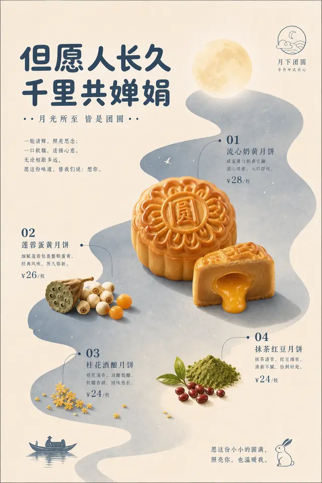
Create a vertical, high-quality, print-ready visual with a specific theme, resembling a reserved yet friendly brand menu page. The image starts with a large area of warm paper color background, maintaining generous margins and breathable whitespace; then derive a soft, irregular structural color field from the source, path, material relationships, or emotional temperature of the theme, making it贯穿 the main image area like an abstract terrain of the theme, serving as background, reading path, and semantic unity, rather than mere decoration. The core object is placed in front of the structural color field in a clean photographic collage or real material sticker style, with clear contours, some parts crossing the edge of the color field, retaining only the most recognizable theme materials, highlights, textures, and forms, with shadows light enough to seem printed on the paper surface. The structural color occupies a secondary large area of the image, with the base color still the most prominent, and the brightest or most material part of the subject becoming the visual focus; the hue can change with the theme, but must maintain a low noise level between the gentle base color, theme structural color, subject material color, and a few emotional points. Text, numbers, small icons, and annotations use a monochromatic system from the same source as the structural color, with titles thick and rounded, friendly and readable, key numbers simple and prominent, explanatory text small and neat, forming nodes close to the corresponding subject like menu annotations, without border cards or multicolored tags. Information clusters are distributed along the path of the structural color field, allowing the gaze to naturally move from one subject node to the next, and using a brief concluding phrase in the blank area to complete the reading. A small linear sign or symbol can be placed in a quiet corner, with a controlled scale and color from the same source, used to confirm the thematic semantics. The overall surface maintains a low-contrast print feel: flat colors are clean, the paper surface is gentle, cutout edges are clear, with only slight contact shadows, without complex scenes, heavy 3D, strong gradients, or promotional stacking; allowing the background field, real subject, monochromatic text, and large whitespace to form a refreshing brand order processed by the same author. —— This theme: May people live long and prosper, sharing the same bright moon across thousands of miles. Requirements: At least 4 highlights, attractive, capable of igniting the desire to participate and think, ratio 2:3
 桃子AI画廊Tao Image Gallery