提示词
Create a finished premium editorial campaign poster, 9:16, full bleed. Real hard-sunlight editorial photography interwoven with monumental flat warm-cream extra-condensed elastic typography.

Direct hard natural sunlight with sharp shadows, rich deep-toned background (navy, teal, dark plum, or deep earth), and a single vibrant natural color accent. Clean authentic textures, no grunge, no artificial distressing.

Monumental extra-condensed heavy uppercase sans-serif letters act as active spatial architecture. The letters stretch, lean, and smoothly warp their baselines to mirror the movement, radial groove, or physical trajectory of the scene while remaining 100% readable.

Integrate photography and typography through purposeful depth overlap: the subject or object physically intersects or passes across the cream lettering to establish clear spatial depth.

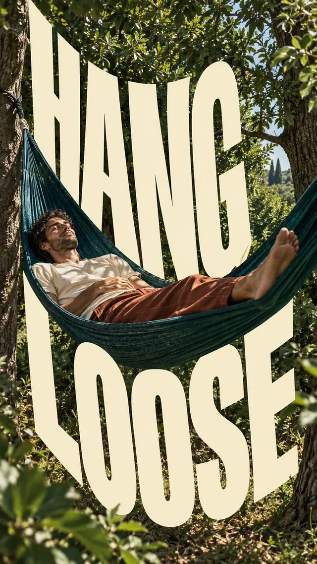
Headline: "HANG LOOSE"
Subject & Action: A relaxed person lying in a woven hammock, one arm and one bare foot dangling over the edge, the hammock sagging deep under their weight.
Setting & Palette: Deep teal shade under palms, hard sunlight cutting through in sharp leaf shadows; the single accent is the saffron-yellow hammock.
Type Path & Warp: The headline sags along the same catenary curve as the hammock, the middle letters dipping lowest and stretching taller, the outer letters leaning up toward the anchor points.
Depth Overlap: The hammock fabric and the dangling arm pass in front of the lowest middle letters, while the hammock ropes run behind the outer letters.

Render cream lettering in flat fill (#F5E9C8) with smooth clean edges; no 3D extrusion, no bevel, no drop shadow, no outlines, no fake brand logos, no filler copy.

Create a finished premium editorial campaign poster, 9:16, full bleed. Real hard-sunlight editorial photography interwoven with monumental flat warm-cream extra-condensed elastic typography.

Direct hard natural sunlight with sharp shadows, rich deep-toned background (navy, teal, dark plum, or deep earth), and a single vibrant natural color accent. Clean authentic textures, no grunge, no artificial distressing.

Monumental extra-condensed heavy uppercase sans-serif letters act as active spatial architecture. The letters stretch, lean, and smoothly warp their baselines to mirror the movement, radial groove, or physical trajectory of the scene while remaining 100% readable.

Integrate photography and typography through purposeful depth overlap: the subject or object physically intersects or passes across the cream lettering to establish clear spatial depth.

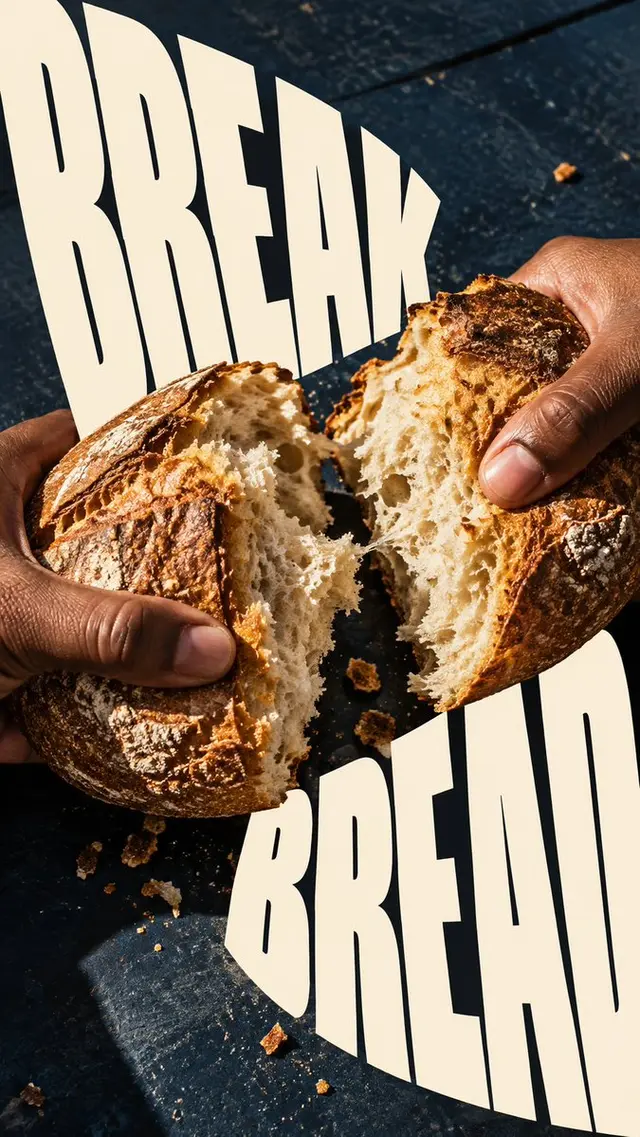
Headline: "BREAK BREAD"
Subject & Action: Two hands tearing a crusty round loaf apart at the center, the halves pulling outward, a few crumbs flying.
Setting & Palette: Deep earth-brown wooden table and dark background in hard raking sunlight; the single accent is tomato-red linen sleeves on the arms.
Type Path & Warp: The headline splits down the middle with the loaf: "BREAK" leans and stretches to the left, "BREAD" leans and stretches to the right, both baselines bending outward like the two torn halves.
Depth Overlap: The hands and the torn loaf sit in front of the split between the two words, with crumbs crossing over the inner edges of the letters.

Render cream lettering in flat fill (#F5E9C8) with smooth clean edges; no 3D extrusion, no bevel, no drop shadow, no outlines, no fake brand logos, no filler copy.

Create a finished premium editorial campaign poster, 9:16, full bleed. Real hard-sunlight editorial photography interwoven with monumental flat warm-cream extra-condensed elastic typography.

Direct hard natural sunlight with sharp shadows, rich deep-toned background (navy, teal, dark plum, or deep earth), and a single vibrant natural color accent. Clean authentic textures, no grunge, no artificial distressing.

Monumental extra-condensed heavy uppercase sans-serif letters act as active spatial architecture. The letters stretch, lean, and smoothly warp their baselines to mirror the movement, radial groove, or physical trajectory of the scene while remaining 100% readable.

Integrate photography and typography through purposeful depth overlap: the subject or object physically intersects or passes across the cream lettering to establish clear spatial depth.

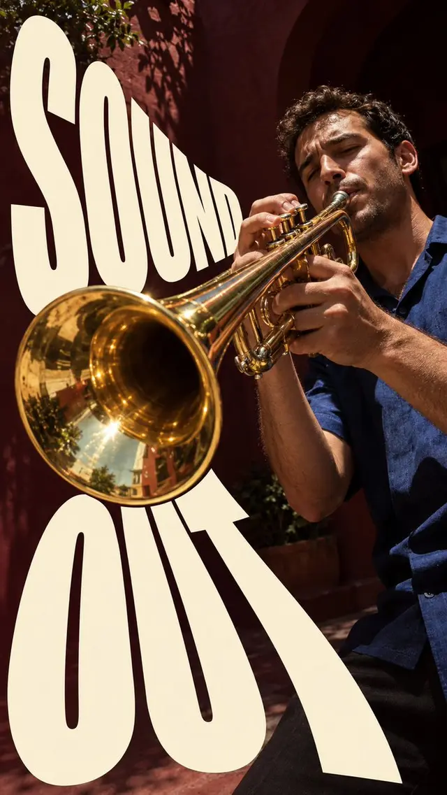
Headline: "SOUND OUT"
Subject & Action: A trumpet player blasting a high note, cheeks full, the brass bell angled up and out on a strong diagonal.
Setting & Palette: Dark plum wall in hard sunlight with a crisp shadow of the player; the single accent is the player's marigold-orange shirt.
Type Path & Warp: The headline blasts out of the bell: the letters fan outward along the diagonal, growing larger and taller the farther they travel, baselines bending in concentric arcs like sound waves.
Depth Overlap: The trumpet bell sits in front of the first, smallest letters, while the player's head and shoulders stay behind the larger letters further out.

Render cream lettering in flat fill (#F5E9C8) with smooth clean edges; no 3D extrusion, no bevel, no drop shadow, no outlines, no fake brand logos, no filler copy.

Create a finished premium editorial campaign poster, 9:16, full bleed. Real hard-sunlight editorial photography interwoven with monumental flat warm-cream extra-condensed elastic typography.

Direct hard natural sunlight with sharp shadows, rich deep-toned background (navy, teal, dark plum, or deep earth), and a single vibrant natural color accent. Clean authentic textures, no grunge, no artificial distressing.

Monumental extra-condensed heavy uppercase sans-serif letters act as active spatial architecture. The letters stretch, lean, and smoothly warp their baselines to mirror the movement, radial groove, or physical trajectory of the scene while remaining 100% readable.

Integrate photography and typography through purposeful depth overlap: the subject or object physically intersects or passes across the cream lettering to establish clear spatial depth.

Headline: "CATCH AIR"
Subject & Action: A person at the lower corner, arm raised, letting out the line as a kite lifts sharply into the wind toward the upper corner.
Setting & Palette: Deep navy sky in hard midday sun; the single accent is the vivid red kite.
Type Path & Warp: The headline climbs the kite line on a rising diagonal, each letter lifting higher and leaning further into the wind, the baseline curving upward as it nears the kite.
Depth Overlap: The kite line passes in front of the letters, the kite itself overlaps the top of the last letter, and the person's raised arm crosses in front of the first letter.

Render cream lettering in flat fill (#F5E9C8) with smooth clean edges; no 3D extrusion, no bevel, no drop shadow, no outlines, no fake brand logos, no filler copy.
 桃子AI画廊Tao Image Gallery