译文
[Theme]: [Theme]
[Chinese Title]: [Chinese Title]
[English Title]: [English Title]
[Core Subject]: [Core Subject]
[Three-Column Relationship]: Character hurdle / Three-column variation of the same subject / Central column as the main scene / Object hurdle / Others
[Left Column Content]: [Left Column Content]
[Center Column Content]: [Center Column Content]
[Right Column Content]: [Right Column Content]
[Main Color Scheme]: [Main Color Scheme]
[Date / Venue]: [Date / Venue]
[Image Aspect Ratio]: 9:16

Generate an oriental culture exhibition poster with high aesthetics and high information density, using a "vertical three-column / left-middle-right composition."

Do not divide the three columns evenly, nor create three independent information boxes. Adjust the width according to the theme flexibly, allowing each column to bear different visual responsibilities. Then, through the subject, text, lines, or material actively crossing the column lines, reconnect the three areas into a complete image.

Choose different methods according to the content:

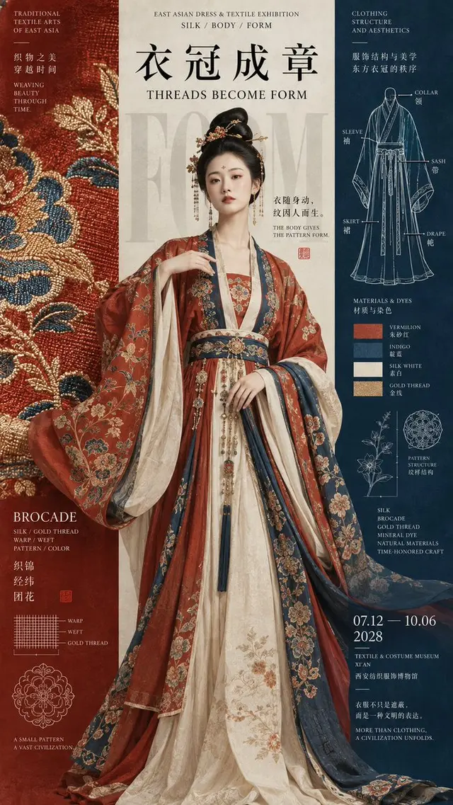
Character hurdle: The character is mainly located in the center column, with sleeves, skirts, or decorations entering the left and right columns. Let the left side be responsible for patterns and materials, and the right side for structure and archive information.

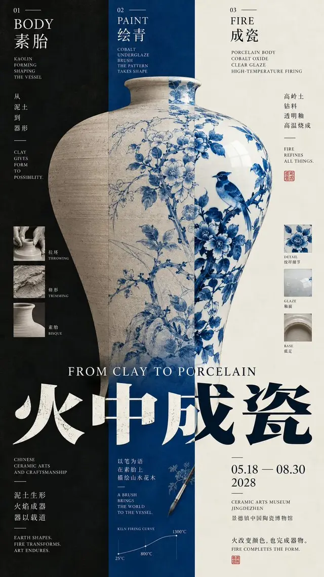
Three-column variation of the same subject: Let a continuous subject pass through all three columns at the same time, presenting different materials, stages, or states in different columns, but the outline must be continuous and cannot become three independent objects.

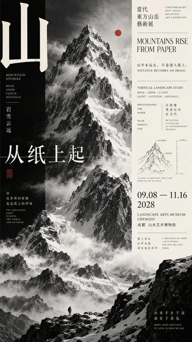
Central column as the main scene: Place the strongest main visual in the central column, such as mountains, buildings, or large images. The left and right columns bear the title, date, material, research information, and allow part of the subject or mist to cross the column.

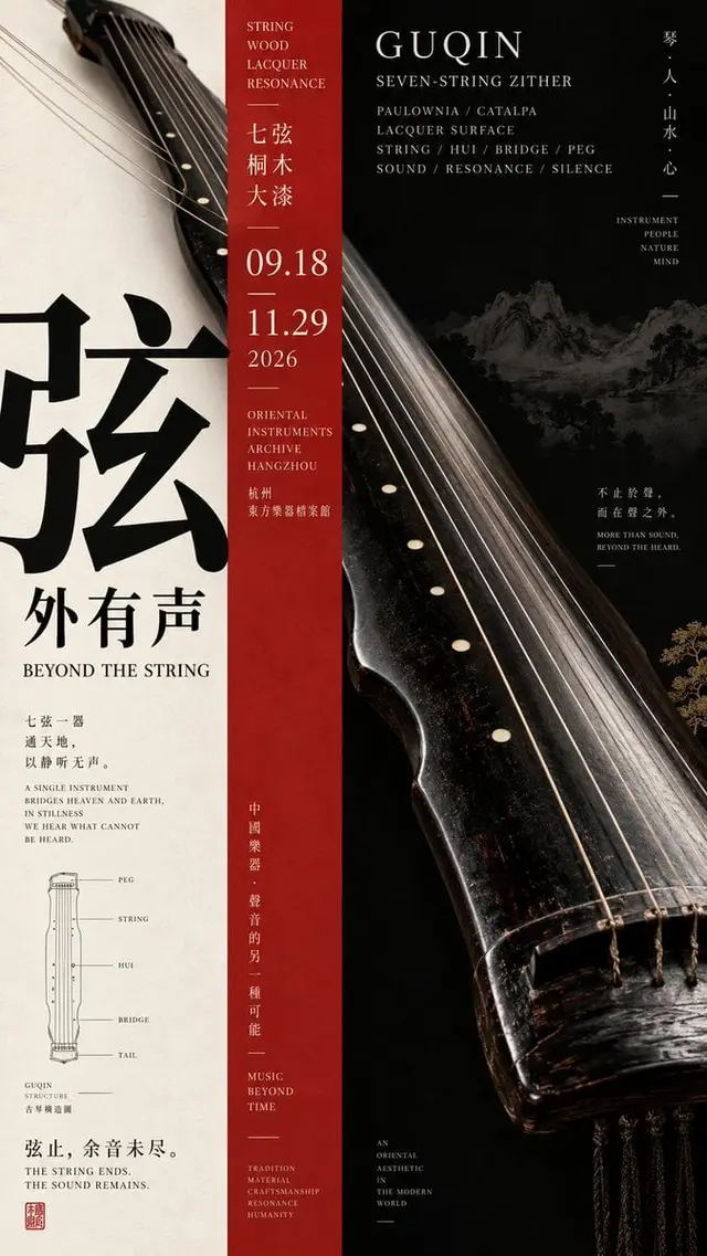
Object hurdle: Large objects enter other columns diagonally or horizontally from one side, using the subject itself to break the vertical grid, making the three columns just a layout order, not physical boundaries.

Typography should be redesigned according to the structure of each image, and can use super-large single words, complete horizontal titles, cross-column titles, medium-scale titles, or small information spines. Do not fix the use of four-character vertical rows, nor repeat the template of "two-character horizontal + two-character vertical."

The information density should be close to mature museum posters, art catalogs, and Editorial Design: add English subtitles, materials, structure, date, venue, curatorial short sentences, and a few research images, but concentrate them in 2-3 areas, do not spread evenly across the entire image.

Small structural line drawings, material research, production process, cross-section, or pattern research can be added, but keep the area moderate, only as a second-level reading content.

Use 3-5 main colors, forming a clear column relationship with large areas of pure color. Allow combinations of black, bone white, vermilion, cobalt blue, deep blue, and ochre, but avoid dirty gray, serious aging, and complex gradients.

Overall requirements: High-definition, clear, clean, rich in information but orderly, accurate subject proportions, sharp text and fine lines, and mature completion of cultural exhibition posters.

Avoid: Mechanical three-way division, three independent cards, PPT information boxes, fixed title templates, too small subjects, completely split columns, random small text, meaningless decorative lines, excessive aging, speckled noise, and low completion level AI poster feel.
 桃子AI画廊Tao Image Gallery