译文
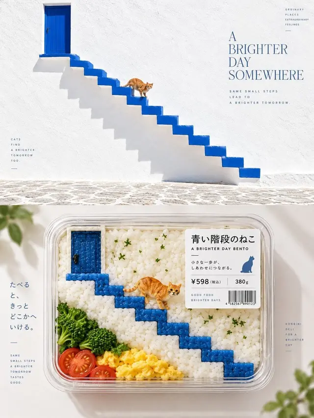
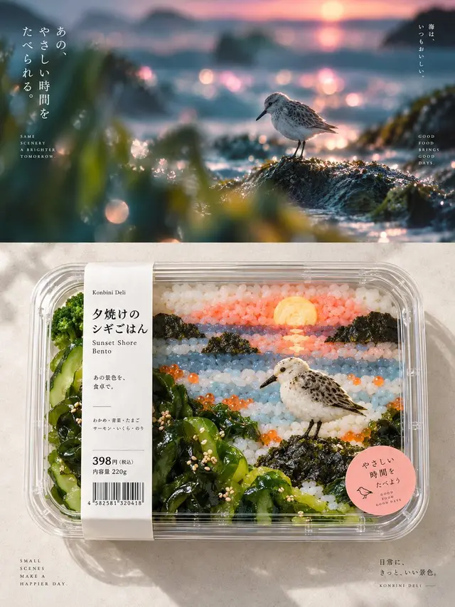
Please create an independent, high-end design poster for each photo you upload, without combining multiple images. Each photo should be output separately. The overall composition should be in a 3:4 vertical format, with the top and bottom sections each having an equal height, occupying 50% of the frame.

The top section retains the original photo, maintaining the subject's identity, structure, posture, real texture, natural lighting, and original color atmosphere. Only a slight advanced color grading is allowed to give it the texture of an art magazine, an independent publication, or an exhibition image. To fit the frame, the environmental background can be naturally expanded, but the subject must not be stretched, distorted, or altered.

The bottom section extracts the most recognizable subject, outline, structure, posture, and narrative relationship from the photo and reconstructs it into a Bento-fication / convenience store ready-to-eat packaging visual. Do not copy the original image item by item, but understand the core visual relationship of the original scene, mapping characters, buildings, plants, skies, water surfaces, objects, or other elements into food semantics and material substitution. Reorganize them using ingredients such as rice, vegetables, eggs, fruits, seaweed, cheese, sauces, jelly, caviar, and herbs, so that the soul of the original scene is recognizable at first glance, and the second glance reveals that all content is actually food.

All visual information is finally contained in a clear convenience store ready-to-eat box, bento tray, or segmented food container. Retain the most important composition level of the original image, but allow for a re-direction: remove irrelevant background, and through cutting, proportion changes, position reorganization, ingredient modularization, and container partitioning, transform the originally complex or ordinary image into a standing product visual. Do not stuff the ingredients to restore the original, but only retain the elements that truly determine the identity.

The bottom section is primarily viewed from a bird's-eye perspective, emphasizing the real transparent box material, ingredient granularity, cross-section, moisture, freshness, and natural light sensation, making it look like a product that can be placed on a premium convenience store shelf. The composition should keep the subject packaging clear, with ample white space around, and the overall image should be clean, delicate, and breathable, without a crowded food platter.

The color palette extracts the most distinctive, most vibrant colors from the top photo and converts them into natural food colors. The colors should be bright, refreshing, tempting, and have a sense of life, such as green transforming into vegetables and herbs, yellow into eggs, corn, or fruits, warm red into tomatoes, caviar, or sauces, and cool colors can be expressed through jelly, packaging, lunch box base paper, or other reasonable food relationships. Avoid dark, greasy, dirty colors, and the feeling of cheap food advertisements.

Add a small amount of product label system to the packaging, which can be freely generated based on the original theme, including product name, short sentences, price, weight, barcode, shelf life information, or mini descriptions. There are no language restrictions, nor fixed fields required. The labels should look like real Japanese convenience store or premium food packaging, with clear hierarchy, controlled size, and naturally combined with the transparent box and ingredient composition.

The overall presentation is in the visual language of Japanese konbini deli packaging aesthetic / packaged-food reinterpretation / semantic food substitution / containerized composition / retail product visualization. The core principle is: not to paint the photo as food, but to retain the visual soul of the original scene and re-direct it with ingredients, containers, and product packaging.
 桃子AI画廊Tao Image Gallery