译文
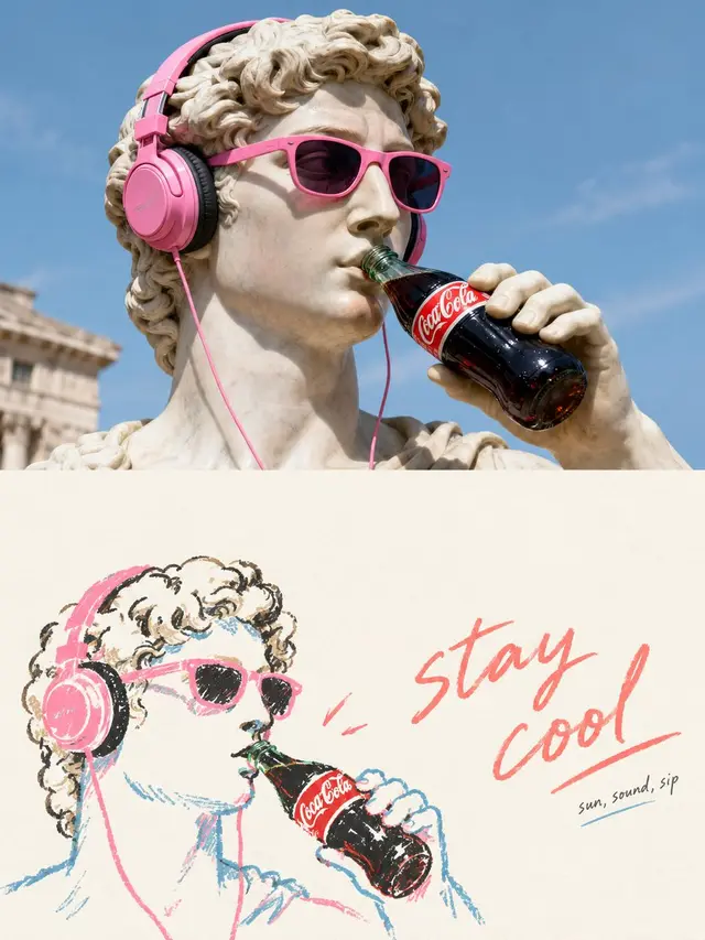
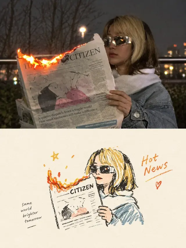
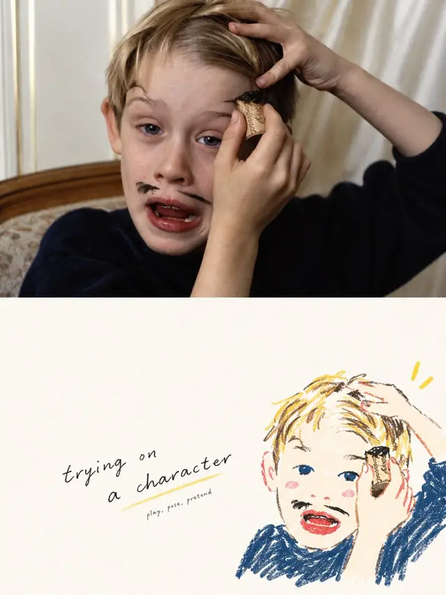
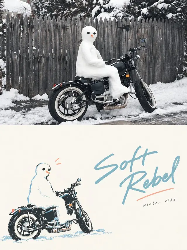
Please create an independent, high-end design poster for each photo you upload, without combining multiple images. Each photo should be output separately. The overall composition should be in a 3:4 vertical format, with the top and bottom sections each having an equal height, occupying 50% of the image.

The top section retains the original photo, maintaining the subject's identity, structure, posture, real texture, natural lighting, and original color atmosphere. Only a slight advanced color grading is allowed to give it the texture of an art magazine or exhibition image. To fit the frame, the environment background can be naturally expanded, but the subject must not be stretched, distorted, or altered.

The bottom section requires a new artistic judgment, extracting only the most recognizable subject, outline, structure, posture, and narrative relationship from the photo, and reconstructing it as a Hand-drawn Doodle Lifestyle Illustration / Naïve Illustration / Marker Drawing. Do not retain all objects or copy the original scene; actively delete the vast majority of the background and irrelevant information, and re-direct the image through reduction, recombination, cropping, and scale changes, so that the original composition, even if ordinary, can be transformed into a stand-alone work.

The style should be simplified, symbolic, relaxed, and individual, using slightly trembling, discontinuous, and irregular hand-drawn lines, as well as natural coloring like markers, crayons, or oil pastels. Minor line crossings, white spaces, and manual errors are allowed, but realism, complete perspective, and detailed depiction are not pursued.

The bottom section must focus on an abundance of conscious blank space as the core, with only a small proportion of the space occupied by solid graphics. The rest of the space should be actively left blank. The subject can be off-center, edge-adjacent, suspended, or partially cropped, with the position determined by the direction of the posture and the visual center of gravity. The blank space, together with the subject, forms positive and negative shapes, distance, pauses, and a sense of breathing. It is better to under-paint than to fill the entire image.

Graphics and text must be repositioned as a whole, not as "one line above and one character below." First, establish an invisible grid, visual axes, and reading paths, and then decide the position of the text; the text can be close to the subject's outline, follow the direction of the action, align with the head or shoulder line, fall in a large negative space, or form an offset, interlock, and non-aligned calligraphy. Avoid mechanical centering, stacking, and fixed templates, allowing the graphics to convey emotion and the text to control the rhythm, both completing the composition together.

Text is not limited to any language, but only retains a very small number of truly meaningful words or short sentences. Use a light, natural, slightly variable font with differences in character width and pen pressure, retaining a touch of casual writing, but the spacing, line spacing, and overall placement must be controlled by editing design. A slightly prominent short sentence can be used with very small auxiliary text to form a hierarchy, but avoid menu-style titles, long paragraphs of text, or full-page text.

The color scheme should be soft, bright, and healing, using a limited color palette extracted from the original image and remixed to create fresh colors like cream yellow, peach pink, coral red, sky blue, lake green, light green, lavender purple, etc. They should be vibrant but not dazzling, soft but not gray and dirty, with warm white or very light composite colors as large areas of breathing space.

The overall pursuit is naive art, mature composition, clever graphic-text relationships, and an abundance of blank space, resembling a high-end independent magazine, lifestyle editorial illustration, or art publication, rather than a child's scrapbook. Avoid the fixed structure of subject-centered + text-centered, randomly scattered small icons around, complex backgrounds, information overload, filling the image, cheap cartoonishness, and templated layout.
 桃子AI画廊Tao Image Gallery