译文
【Theme】[Theme]
【Main Title】[Title]
【Image Content】[Image Content]
【Layout】[Layout]
【Main Color】[Main Color]
【Accent Color】[Accent Color]
【Aspect Ratio】9:16

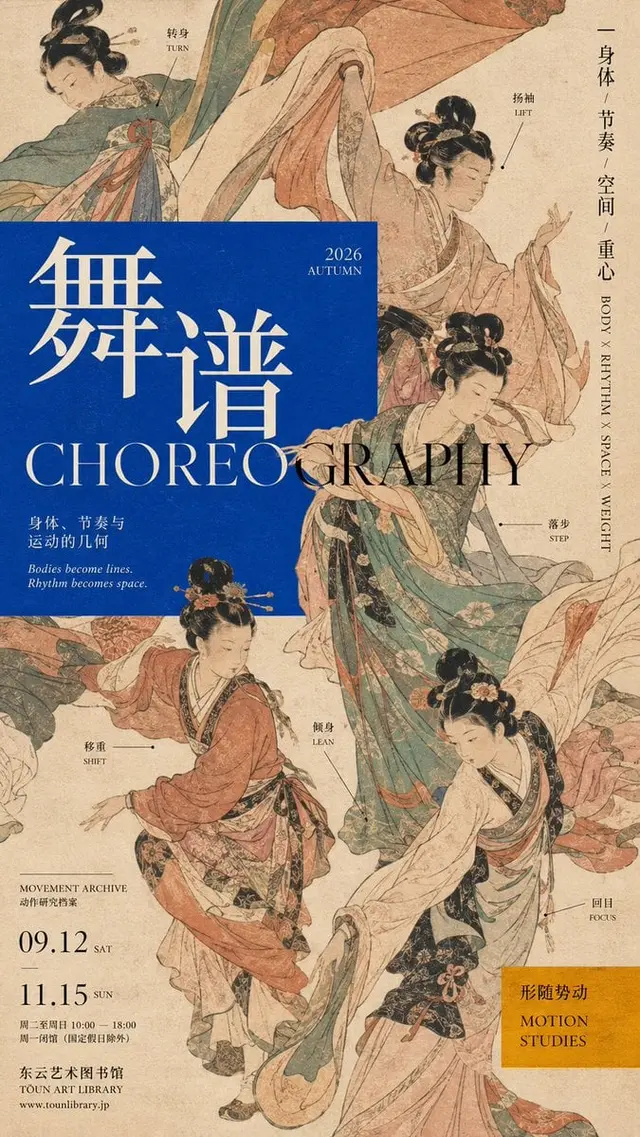
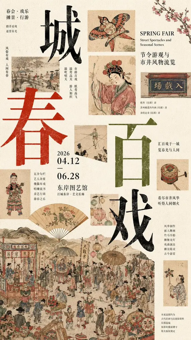
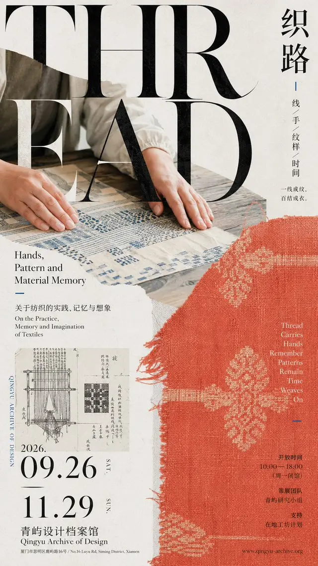
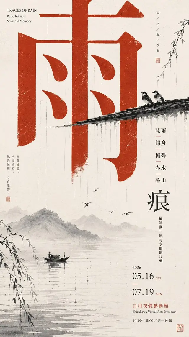
Create a poster with a graphic arrangement that embodies Japanese cultural publications and Editorial Graphic Design aesthetics.

Choose a clear layout mechanism as the core and avoid using a fixed "title + main image + information bar" template.

Let large titles, images, photographic slices, color blocks, and small-sized information text interlace, overlap, cross regions, and be cut, making Typography truly part of the composition.

Use a large main title × extremely small information text scale contrast; boldly cut the subject without requiring a complete display; concentrate information in a local area, maintaining high density but order.

The color scheme varies freely according to the theme, controlling 2-4 main colors to maintain the modern cultural publication and art exhibition atmosphere.

The overall look should be like a real Japanese art museum poster, art magazine cover, or cultural catalog, rather than a common promotional template.

Avoid average layout, card UI, meaningless English, random codes, cheap vintage effects, excessive CG, numbering, and sparkle.
 桃子AI画廊Tao Image Gallery