译文
【Subject / Title】:[Subject Name]
【Core Content】:[Core Content]
【Scatter Type】:[Scatter Type]
【Primary Visual Anchor】:[Primary Anchor]
【Secondary Elements】:[Secondary Elements]
【Main Color Scheme】:[Main Color]
【Accent Color】:[Accent Color]
【Chinese Title】:[Chinese Title]
【English Title】:[English Title]
【Aspect Ratio】:9:16

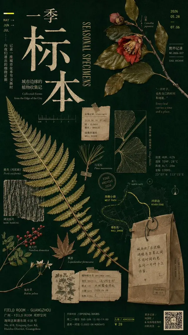
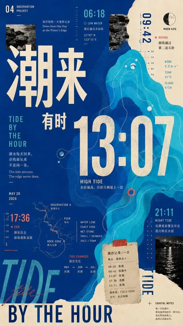
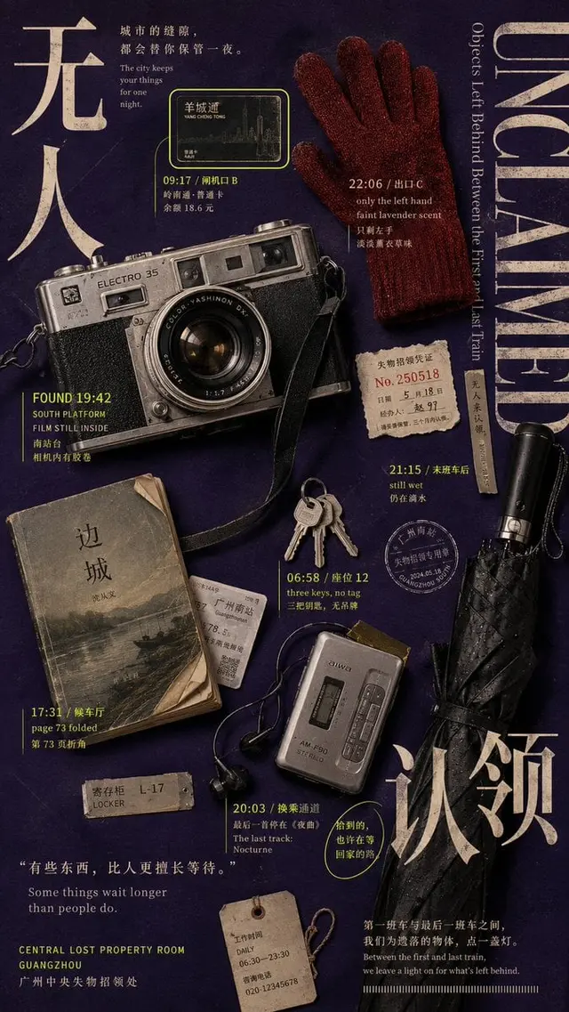
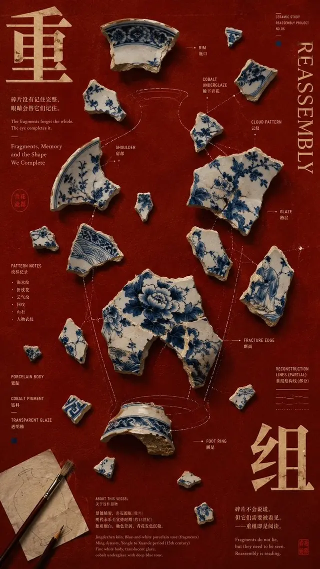
Create a scatter composition poster with high information density, mature Editorial Graphic Design, and a cultural exhibition atmosphere. The core is not to randomly scatter elements across the canvas, but to establish multiple visual anchors of different sizes, directions, and densities, and then organize them into a complete work through color, typography, spacing, repetition, and invisible grids.

The entire image should have about 4-7 main visual anchors and allow for the addition of more micro information particles. Maintain clear hierarchy: the primary visual anchor should carry about 30%-40% of the visual weight, the second and third anchors should be of a lower level, and other elements should be interspersed as small scatter points. Create rhythm through at least 3 scale levels: ultra-large title/main content → medium-sized image/object → extremely small text, numbers, labels, and details, ensuring that not all elements are of similar size.

Choose an appropriate scatter method based on the content: similar elements can form rhythm through size, direction, distance, and local cropping without forming a regular grid; solid objects can be arranged in a staggered manner using different contours, materials, and visual weights; numbers, time, coordinates, and data can be scattered across different areas, creating a skimming path with font size and color; fragmented structures can be arranged around an invisible whole, reconnecting visual scatter points through negative space, local contours, or pattern continuity, prompting the audience to actively complete the complete form.

The image information can be rich, but do not distribute it evenly. Suggest forming 2-3 high-density areas, 1 medium-density area, and retaining at least 20%-30% of quiet space. Establish 3-4 invisible vertical or horizontal baselines to visually align titles, image edges, numbers, and labels; allow for active breaking of the grid, but there must be a grid logic first. Add about 3-4 controlled interweaving relationships, such as text locally obscured by the main content, images pressing against the title edge, labels slightly overlapping objects, and blocks or lines crossing different information areas.

Color control should be limited to 2-4 main color schemes, and colors should not be used evenly. Determine a main structural color, and then disperse the same accent color in different areas, reconnecting visual scatter points through distant color echoes. Typography needs to have clear levels: large Chinese titles should carry the main visual weight, English titles should establish the second level of structure, numbers and dates can become independent visual anchors, and body text and labels should maintain a smaller font size; allow for horizontal, vertical, local rotation, and cropping, but do not randomly rotate all text.

All text must belong to the work itself, such as time, location, material, observation records, work phrases, object names, or related data; do not use placeholder text such as "scatter composition," "design case," "Visual Study," "Composition," "Series 01," etc. The first thing to see should be 1-2 strong visual anchors, and the second look should jump between different scatter points, with the third look discovering echoes between color, size, direction, and information; there should still be second and third-level details to read when zoomed in.

Overall requirements: high information density, disorganized but not chaotic, multi-anchors but clear hierarchy, rich, rhythmic, and with a sense of work, like a mature art exhibition poster, independent publication, or Editorial Poster. Avoid regular nine-square grids, evenly scattered elements, all content being the same size, every area being stuffed, PPT information blocks, meaningless English, too many borders, random sticker collage, and lack of hierarchy.
 桃子AI画廊Tao Image Gallery