译文
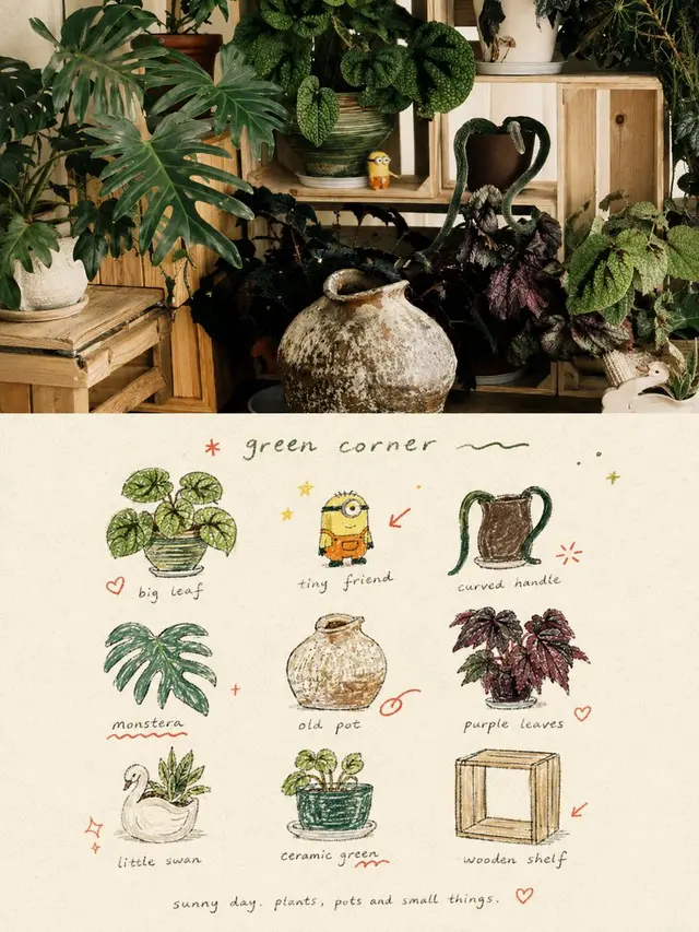
Please create an independent, high-end design poster for each photo you upload, with no collage of multiple images, each photo output separately. The overall composition should be in a 3:4 vertical format, with the top and bottom sections each having the same height, occupying 50% of the image.

The top section retains the original photo, maintaining the subject's identity, structure, posture, real texture, natural lighting, and original color atmosphere. Only a slight advanced color grading is allowed to give it the texture of an art magazine, an independent publication, and exhibition images. To fit the frame, the environment background can be naturally expanded, but the subject must not be stretched, distorted, or altered.

The bottom section extracts the most recognizable subject, local elements, action clues, object details, and narrative relationships from the photo, reconstructing them into a visual system consisting of a 3x3 modular icon grid + hand-drawn naive doodle illustration + crayon/pencil particle texture + handwritten text. Do not copy the original image completely, nor create a realistic illustration. Instead, compress complex information into 9 memorable visual units: these can be the subject itself, local features, personal items, plants, food, means of transportation, posture, emotional symbols, or small memory points in the scene. Each unit should be an extension of the semantic content from the same image above, making it immediately apparent that they belong to the "memory list" of the same photo.

The composition uses an implicit 3x3 loose grid. The grid is only a base order, and does not need to be too neat; the position, size, angle, and landing point of each icon can be slightly offset to form a loose grid/organic grid that is both orderly and not mechanical. A brief handwritten title can be added to the top, along with a few light wavy lines, stars, or symbols; a very small handwritten caption can be added to the bottom to make the overall composition feel like a page from a personal notebook, visual diary, or collection sheet. There must be ample white space, and the layout should be relaxed, cute, and克制 without being chaotic.

The style should be Naïve Hand-drawn Doodle Illustration: simple shapes with a slightly naive feel, slightly trembling contours, uneven thickness, and not completely closed, retaining conscious imperfection. Coloring should not be too full, allowing the paper texture, white particles, and rough edges to be seen. Black fine line contours, colored pencil/crayon filling, and a small amount of local color blocks can be mixed, without relying on real lighting and shadows to shape the graphics. If grid auxiliary lines appear, they should be extremely faint, like a pencil sketch, not a computer-drawn regular table.

The color scheme should be a low-saturation retro candy color palette, with a warm beige coarse paper background, maintaining soft, light, friendly, and sophisticated colors. Colors can be extracted from the original image and translated into sage green, mint green, crayon blue, cobalt blue, cream yellow, gray powder, strawberry pink, coral orange, and other comprehensive color relationships: usually with blue-green as the main color, yellow-pink as the object filling, and orange only used in a very small amount for emphasis. The overall control should be a large area of beige background, moderate blue-green main color, small area of yellow-pink auxiliary color, and a very small amount of orange highlight, making the image rich but not cluttered.

Add a layer of hand-drawn red annotation elements in small quantities, such as circles, arrows, hearts, starbursts, small crosses, wavy lines, or emphasis marks, to transform the work from a common icon page into a more editorial and personal visual diary. However, these annotations must be few and accurate, only as a secondary highlight, not overshadowing the main content.

Text is not limited to fixed content or language, and should be generated freely based on the theme, mood, location, action, or life feeling of the photo, with a few truly meaningful words. The title and descriptive text should use a light, relaxed, slightly hesitant handwriting font, making the text look like spontaneous notes written on paper, not commercial排版 titles. The overall text should be minimal, small, with ample white space, and form a natural图文 mix with icons and annotations.

The overall presentation should be naive, relaxed, retro, healing, light, friendly, and editorially designed, like a carefully collected personal notebook, happiness list, or life observation page. Avoid clean vector feeling, real lighting and shadows, complex textures, heavy shadows, overly neat UI icon feeling, commercial template feeling, and children's cartoonization.
 桃子AI画廊Tao Image Gallery