译文
【Theme】:[Theme]
【Chinese Main Title】:[Chinese Main Title]
【English Title】:[English Title]
【Core Visual】:[Core Visual]
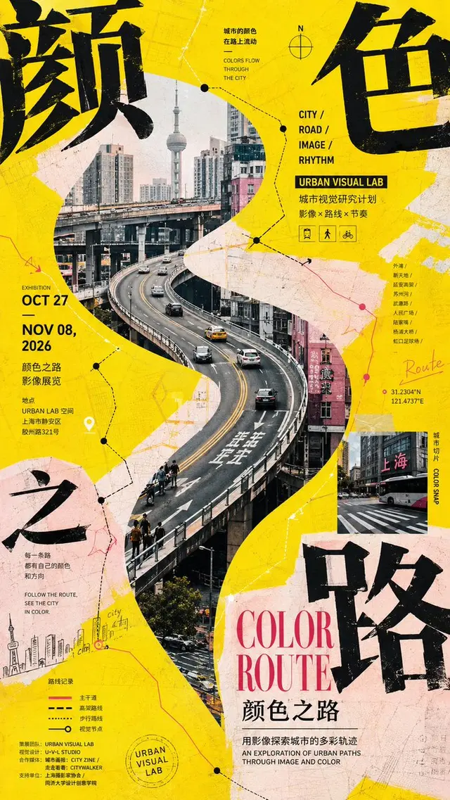
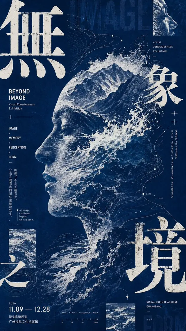
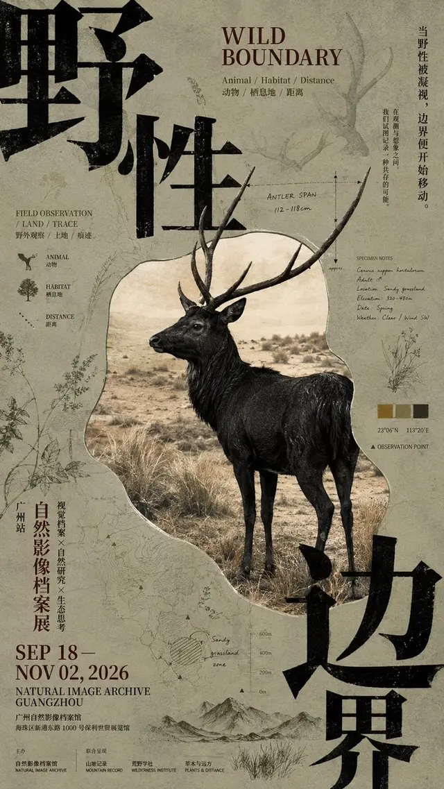
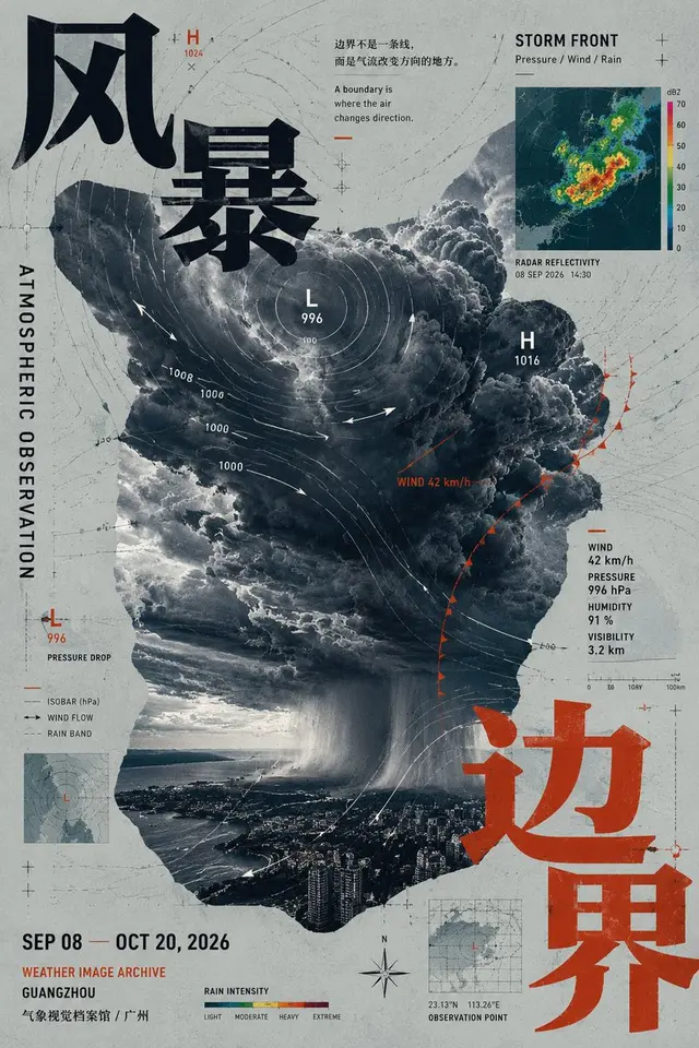
【Alien Image Style】:Irregular window / Main break frame / Partial slice / Image fusion
【Angle Compression Style】:Giant letter fragments / Double angle compression / Main break frame / Graphic angle compression
【Auxiliary Visual System】:[Auxiliary Visual System]
【Background Information Layer】:[Background Information Layer]
【Main Color Tone】:[Main Color Tone]
【Emphasized Color】:[Emphasized Color]
【Date / Institution】:[Date / Institution]
【Image Aspect Ratio】:9:16

Generate a high-density poster with a strong sense of editing design and cultural exhibition atmosphere. The core objective is not to reduce information, but to allow large Chinese characters, irregular main images, lines, graphics, small information, and background textures to coexist through clear visual hierarchy, forming a "chaos with order" layout effect.

Firstly, determine 1 absolute main visual anchor point, and then set 2-3 secondary visual anchors. The main visual can adopt alien cutting, contour window, partial break frame, or image fusion, but not just a regular rectangular photo. The large Chinese title must truly participate in the composition, which can be inserted from the edge, partially cut, and interlaced with the main image, becoming part of the layout structure, not just simply pasted next to the picture.

Maintain a medium to high information density, add Chinese and English titles, dates, institutions, short descriptions, vertical text, partial examples, data, coordinates, lines, or small image slices, but different elements must have obvious scale differences. Form a strong font size jump between super-large fonts, medium-sized titles, and extremely small information, do not let all text sizes be close, and do not evenly distribute the content throughout the entire picture.

The entire poster uses only one set of auxiliary visual language related to the theme. For example, for urban themes, use routes and street graphics; for concept themes, use streamlines and image fragments; for natural themes, use plant line drawings and specimen information; for meteorological themes, use isobars, wind directions, and radar charts. Do not pile in multiple unrelated decorations at the same time.

The background must also participate in the design, which can include very faint patterns, maps, structural diagrams, archive text, data shadows, or material textures, making the blank areas have content, but the background layer must be significantly weaker than the main body.

Allow text to overlay images, images to break frames, lines to cross areas, and small image slices to overlap the layout, increasing a postmodern editing sense through partial occlusion and incomplete alignment. However, all elements must be organized around the same visual center. Overall, maintain 1 main anchor point + 2-3 secondary anchors, avoiding true disarray.

Color control is limited to 3-5 main colors, establishing a clear color stance, which can use high saturation main colors with black and white, or adopt a unified monochrome system. Do not let multiple high saturation colors compete evenly.

The reading order should be: first, see the main subject and large angle text; second, discover the relationship between alien images, graphics, and lines; third, read the date, description, data, and edge information.

The final effect should be like a mature cultural exhibition poster, design school visual, or editing publication: rich in information, complex in hierarchy, local collisions, but still having a clear visual center when zoomed out. Do not make an infographic PPT, and do not fill the entire picture randomly for the sake of "complexity."
 桃子AI画廊Tao Image Gallery