译文
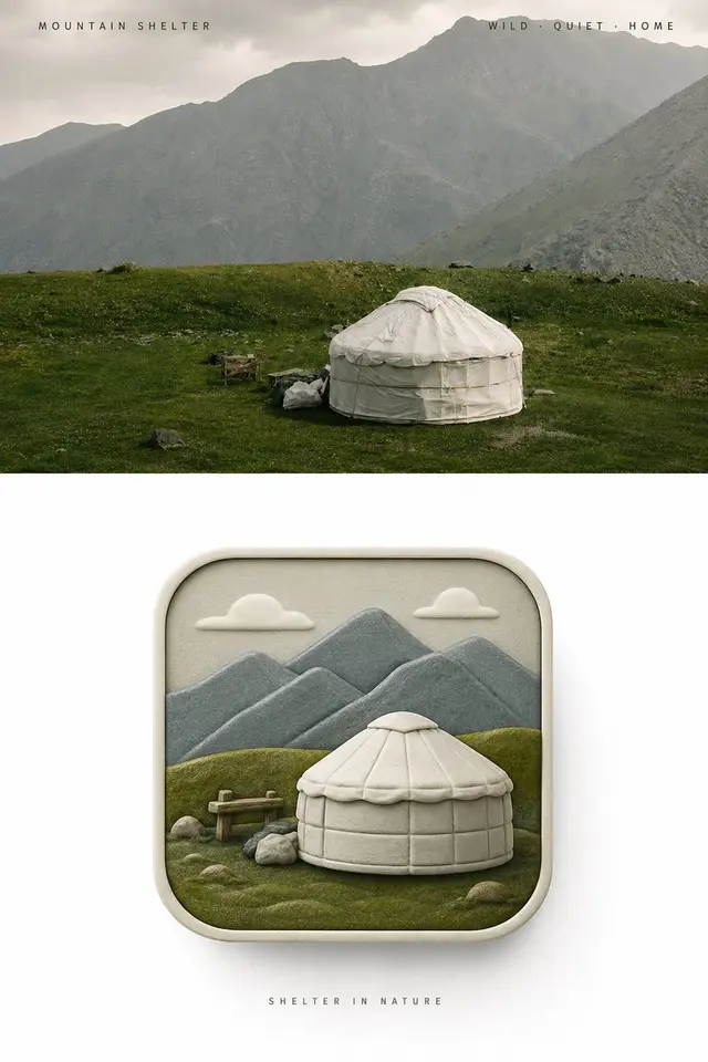
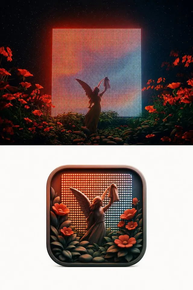
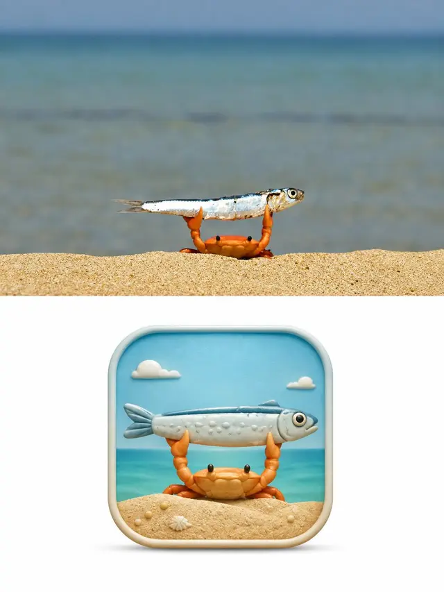
Please create an independent, high-end design poster for each photo you upload, without combining multiple images. Each photo should be output separately. The overall composition should be in a 3:4 vertical format, with the top and bottom sections each having the same height, occupying 50% of the frame.

The top section retains the original photo, maintaining the subject's identity, structure, posture, real texture, natural lighting, and original color atmosphere. Only a slight advanced color grading is allowed to give it the texture of an art magazine, independent publication, and exhibition image. To fit the frame, the environmental background can be naturally expanded, but the subject must not be stretched, distorted, or altered.

The bottom section extracts the most recognizable subject, outline, structure, posture, and narrative relationship from the photo. First, understand the original image's truly worth-keeping emotions, actions, relationships, or visual metaphors, and then reorganize them into a pseudo-3D rounded icon with an original concept. Do not simply shrink the photo into the icon but reconstruct the "soul" of the original image with the least but most critical elements, making the subject recognizable at first glance, understandable at second glance, and emotionally resonant at third glance.

The outline of the icon must always remain a standard 1:1 square rounded rectangle, with equal sides, uniform rounded corners, frontal view, and stable proportions, resembling a complete and standardized high-end App Icon. Prohibition of elongation, flattening, tilting, perspective distortion, trapezoidal, or altering the subject's outline. The rounded square is just a fixed visual stage, where all creativity, space, and narrative occur within this boundary.

The interior of the icon uses a frontal view pseudo-3D/2.5D spatial language. The subject is the absolute visual core, surrounded by only a few environmental relationships that strengthen the narrative. Through real front-to-back occlusion, volume thickness, height and depth levels, soft edges, local bas-reliefs, and spatial distance, a rich sense of three-dimensionality is formed. Multiple elements can have different depths, but they should grow naturally in the same continuous space, not as layers of paper cutouts stacked on top of each other. Avoid isometric sand tables, bird's-eye models, paper stacking, and complex realistic perspective.

The composition prioritizes the most powerful core visual relationship in the original image. Proportional exaggeration, local magnification, front-to-back interweaving, form resonance, spatial compression, or symbolic transformation can be used to strengthen the metaphor, but all changes must serve a clear theme. The image maintains a clear visual center of gravity, distinct subject outline, and good negative space, ensuring that the icon retains strong recognition and unique memory points even when reduced, rather than a common "object-centered" template icon.

The color palette is completely derived from the original photo above, without preset fixed color menus. First, identify the main color that best represents the subject's identity and emotion, the most vibrant color, and the auxiliary color that balances the space. Then, re-moderate while maintaining the original color memory: moderately increase brightness and purity, remove grayish dirt and mixed colors, organize the warm and cold relationships, pull apart the main and secondary levels, and strengthen the most spirited colors. The final color can be more vibrant, transparent, and full of life, but it should still make people naturally feel that it comes from the original image, not from another color palette template. Avoid dark, outdated, average color selection, colorful without focus, fluorescence, and cheap candy-like feeling.

The texture uses a delicate, matte, soft modern pseudo-3D sculpture feel, between high-end editing illustration, miniature art models, and brand 3D visuals. The form has real volume and soft levels, but is not overly smooth, reflective, or CG-like; avoid paper-cutting, plastic toy, glass jelly, metal highlights, and game UI textures.

The outer perimeter of the bottom section maintains a large area of clean white space, displaying only this complete rounded square icon. If text is needed, only use a minimal amount of delicate editorial text placed outside the icon, establishing a quiet, restrained relationship with the overall layout, without adding surrounding decorations or visual noise.

The overall pursuit is a fixed rounded square stage + soul extraction from the original image + frontal pseudo-3D levels + artistic guidance of original image color + strong recognition and original metaphor. The final product should be like a truly viable piece for a brand visual proposal or icon creative review, rather than a photo thumbnail, paper-cutting illustration, isometric model, or templateized App Icon.
 桃子AI画廊Tao Image Gallery