译文
Please create an independent, high-end design poster for each photo you upload, without combining multiple images. Each photo should be output separately.

The overall composition should be in a 3:4 vertical format. The image should be strictly divided into four horizontal sections from top to bottom, with each section's height precisely occupying 25% of the overall image. The four layers should have a strict ratio of 1:1:1:1, and there should be no proportion deviation. The sections should seamlessly connect without any separation lines or gaps. The "no gaps" refers only to the seamless connection between layers; within each layer, negative space, paper background, or solid color background can still be retained according to the corresponding style.

All four layers should be based on the same uploaded photo, presenting the same subject, moment, and spatial relationship. Strictly maintain the subject's identity, quantity, key structure, proportion, posture, action direction, gaze, observation perspective, perspective, occlusion, left-right position, front-back relationship, and core narrative. The four layers are not four unrelated new compositions but a continuous translation of the same scene in different styles. Since each layer is approximately a 3:1 extremely narrow horizontal banner, the subject should be organized horizontally and retain an appropriate amount of breathing space on both sides. Background extension or slight trimming is allowed horizontally, but not vertically stretching the subject, cutting off key parts, changing the relationship between characters, or creating a scene unrelated to the original image.

The visual center of gravity, subject proportion, and contour landing points of the four layers should be as aligned as possible vertically, forming a coherent evolution from real photography to the target style. Each layer must completely fill its 25% area. Do not add layer numbers, separation lines, borders, collage gaps, watermarks, or logos. Unless a layer's style description explicitly requires a small amount of editing text,票据marks, or handwritten notes, do not generate additional text; if text is needed, it must be minimal, restrained, not obstructing the subject, and try to avoid garbled text.

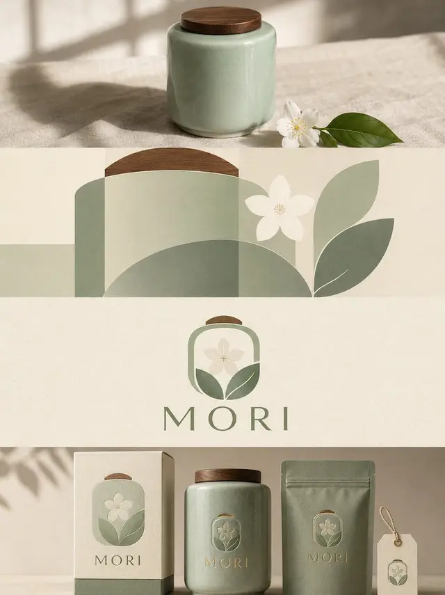
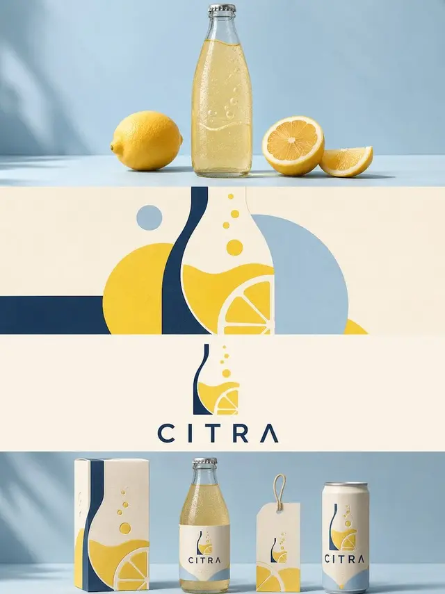
First Layer | Original Photography

Directly retain the true photographic state of the uploaded photo as the visual benchmark for the translation of the styles in the following three layers. Maintain the original identity, quantity, facial features, hairstyle, clothing, structure, proportion, posture, action, gaze, interaction relationship, observation perspective, perspective, occlusion, environmental direction, natural light and shadow, and core color of the characters or subjects, without illustration, materialization, geometricization, or 3D reconstruction.

To adapt to the extremely narrow horizontal banner of about 3:1, only the left and right sides of the background can be naturally extended in accordance with the logic of the original scene, or slightly trimmed without damaging the subject; the proportion of the subject should not be changed, and neither should the characters or buildings be stretched, nor should the head, hands, feet, key objects, or important narrative relationships be cut off. The image should remain natural, real, and clear, avoiding excessive skin smoothing, exaggerated color adjustment, fictional scenery, and decorations unrelated to the original image.

Second Layer | Humanistic Geometric Abstract

In this layer's approximately 3:1 narrow horizontal banner area, translate the real subject from the first layer into a "humanistic geometric abstract" style. Maintain the subject's identity, quantity, key structure, posture, left-right position, perspective, spatial relationship, and core narrative consistent with the first layer, and then fully implement the following visual requirements:

The entire image uses a clean ivory background, extracts the most identifiable subject, contour, posture, and narrative relationship from the photo, and transforms them into an minimalist abstract visual according to the logic of "deconstruction - selection - refinement - reconstruction." Focus on retaining the most unique volume proportion, axis, curve, interlocking, overlapping, occlusion, negative space, and asymmetric relationship, and reorganize with a small number of geometric shapes; do not completely replicate details, but must be able to feel the correspondence with the uploaded original image. The composition emphasizes visual center of gravity, scale difference, main and secondary levels, positive and negative shapes, and blank rhythm, avoiding iconization, even arrangement, and fragmented accumulation.

The color scheme is extracted and simplified from the original image into 1 main color, 1 dark structural color, 1 light/neutral color, and at most a small amount of key emphasis color. Prioritize retaining the most identifiable and vital colors from the original image, and establish levels through area proportion, depth relationship, and local contrast, maintaining a clean, restrained, and lively look, avoiding overall greying and even color use.

The text establishes a complete advanced editing micro-typesetting system: extract a 2-5-word poetic English main title from the light and shadow, space, action, material, or emotion of the photo, and pair it with 2-4 groups of extremely small auxiliary texts, which can be freely combined from short sentences, state words, location or object information, number, chapter mark, serial number, scale number, directional words, material words, archival tags, or mini descriptions, without using years. The main title is responsible for emotion, and the small text is responsible for order and detail, making the text like editorial annotations in art books, architectural journals, or exhibition catalogues, rather than a common title.

The text must be composed with the abstract graphics, and can be arranged along geometric axes, edges, contours, or negative spaces, can be vertically arranged, rotated, columnar, spaced out, aligned to the edge, pressed at the corner, crossed over color blocks, embedded between shapes, or interlaced with the subject; a small group of text can be extremely small, and a slightly larger group, through font size contrast, spacing, direction, and position, establish a reading path. The overall use of restrained serif fonts and thin editing fonts, with abstract shapes responsible for visual memory and text responsible for structure, rhythm, and a sense of seniority.

The overall presentation presents the visual quality of original image × abstract memory × editing layout, modern, quiet, restrained, delicate, artistic, and collectible, avoiding complex collage, cheap decoration, commercial template sense, and meaningless abstraction.

Third Layer | Graphic Text Integration Logo Reconstruction

In this layer's approximately 3:1 narrow horizontal banner area, translate the real subject from the first layer into a "graphic text integration Logo reconstruction" style. Maintain the subject's identity, quantity, key structure, posture, left-right position, perspective, spatial relationship, and core narrative consistent with the first layer, and then fully implement the following visual requirements:

Extract the most identifiable subject, contour, posture, and narrative relationship from the photo and reconstruct it into a simple, professional, and brand-identifiable custom logo/brand (Logo) graphic. Do not place the subject graphic separately next to the text, but ingeniously integrate its most critical contour, structure, or feature into the letters themselves or the overall logo structure, making the graphic and text a unified, complete, and identifiable visual symbol. Whether the subject is a person, animal, plant, building, object, vehicle, or natural landscape, the most core visual characteristics should be extracted, and transformed into a simple, geometricized, graphicized logo language, maintaining an identifiable identity in the least amount of information.

The text is extracted from the subject's name, thematic attributes, location clues, action state, or symbolic meaning in the photo into a short English main text; if the original image itself has a clear proper name, it can be directly converted into the main identification name; if there is no clear name, then extract a highly summarized, easily identifiable English word or phrase suitable as a brand logo. A small amount of auxiliary small text can be added, such as category, region, state words, or short slogans, but it must be highly restrained and only serve as a supplement to the identification level. The text and graphics must together constitute the logo, rather than a conventional collage of "icon + title."

The overall style maintains a minimalist, modern, geometric, eye-catching, elegant, abundant in blank space, and balanced composition. The background uses a light solid color or a very light neutral color, maintaining a clean and simple look; the logo is presented in black and white or a very small amount of color, and the color can be slightly translated from the most spiritually expressive color in the uploaded original image, but the overall still prioritizes restraint, professionalism, and brand identity. The logo maintains a comfortable medium visual size in the entire image, neither too large nor too small, with the maturity of a brand identification, cultural visual system, or a high-end design studio's work.

The overall emphasizes the integration of graphics and text, subject recognition, geometric order, refined spacing, professional layout, and senior blank space, presenting the visual quality of modern logo design combined with art posters. Avoid the sense of travel posters, simple icon + text, cartoonization, decoration stacking, e-commerce sense, cheap graphics, and template sense.

Fourth Layer | Brand Packaging System Mockup

In this layer's approximately 3:1 narrow horizontal banner area, translate the real subject from the first layer into a "brand packaging system Mockup" style. Maintain the subject's identity, quantity, key structure, posture, left-right position, perspective, spatial relationship, and core narrative consistent with the first layer, and then fully implement the following visual requirements:

Extract the most identifiable subject, contour, posture, and narrative relationship from the photo and transform it into a complete brand packaging and material visual system. Do not simply copy the photo, but refine the subject's features into reusable core graphics, illustration symbols, patterns, color blocks, or identification elements, and then apply them to different sizes and purposes of packaging carriers, making all materials easily identifiable as belonging to the same visual family.

Automatically select the most suitable 5-8 types of carriers based on the theme of the original image, such as paper bags, packaging boxes, sets, labels, hangtags, tickets, cards, stickers, envelopes, cup packaging, keychains, packaging paper, or other related materials, without forcing the use of fixed categories. Use 1-2 main packaging as the visual focus, and the rest of the materials form modular combinations according to size, horizontal and vertical proportions, and function; use clear grids, edge alignment, scale contrast, spacing rhythm, and large areas of blank space to organize the image, like a professional brand design studio's packaging visual identification proposal board, rather than a product display or chaotic prototype display collage.

The color scheme maintains a soft, transparent, slightly desaturated advanced color system, mainly in light pink blue, misty blue, sky blue, air-like cool tones, paired with ivory white, cream white, light beige, soft gray green, and architectural neutral colors, and only use a small amount of gray tone rose pink or low saturation blush pink as a visual jump point. Different packaging can change the color area and combination method, but must maintain the same color system, forming a rich and unified series sense.

The material emphasizes the realistic and delicate paper and packaging process, and can express matte paper, fine-textured paper, thick card, semi-transparent paper, embossing, die-cutting, folding, stickers, local printing, and slight layering relationships; light is soft and natural, only used to express the thickness of paper, creases, and material differences, avoiding plastic feel, strong reflection, exaggerated three-dimensional, and cheap product rendering.

The text is also unifiedly designed as part of the entire packaging system. Extract a short English main title from the subject's name, theme, emotion, function, or symbolic meaning in the original image, and extend it to a small amount of subtitle, short sentence, number, category name, or mini description. The text can naturally change according to different carriers: vertically on hangtags, along the packaging edge, around circular labels, across the box surface, hidden between graphics, or becoming part of the packaging seal structure, making the font, graphics, and materials together form a complete brand language, rather than repeating the same title on each piece of material.

The overall presentation is a high-end brand packaging system/visual identification proposal board: rich but not crowded, lively but orderly, showing the complete series while also seeing the design logic between graphics, text, materials, and different carriers. Regardless of whether the original image is a person, animal, plant, building, object, food, vehicle, or natural landscape, a unique packaging language should be established from the original image itself, avoiding fixed product combinations, repeated templates, e-commerce display sense, and ordinary brand prototype display kits.
 桃子AI画廊Tao Image Gallery