译文
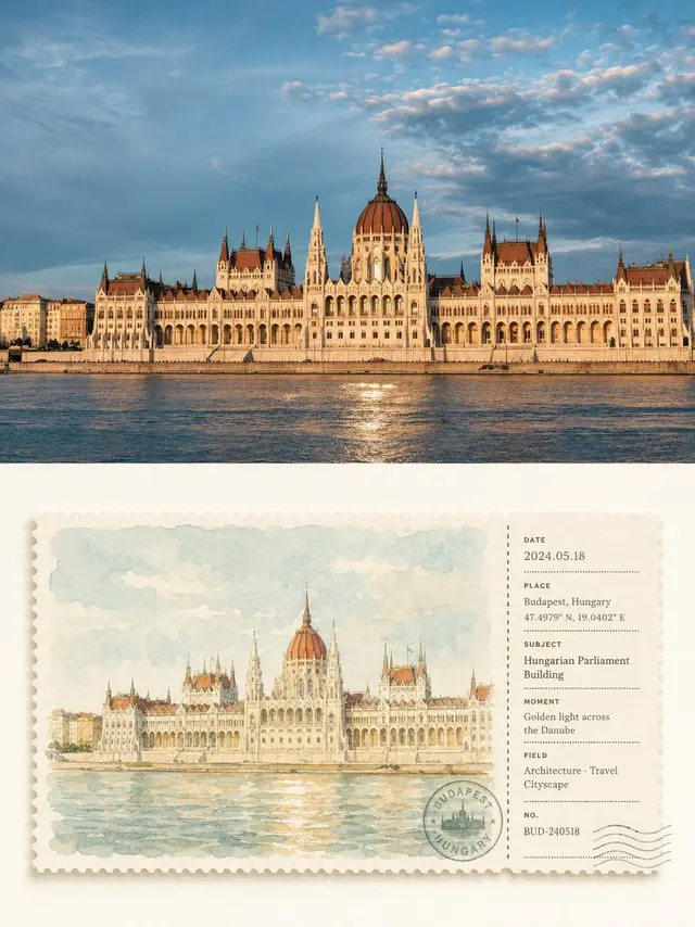
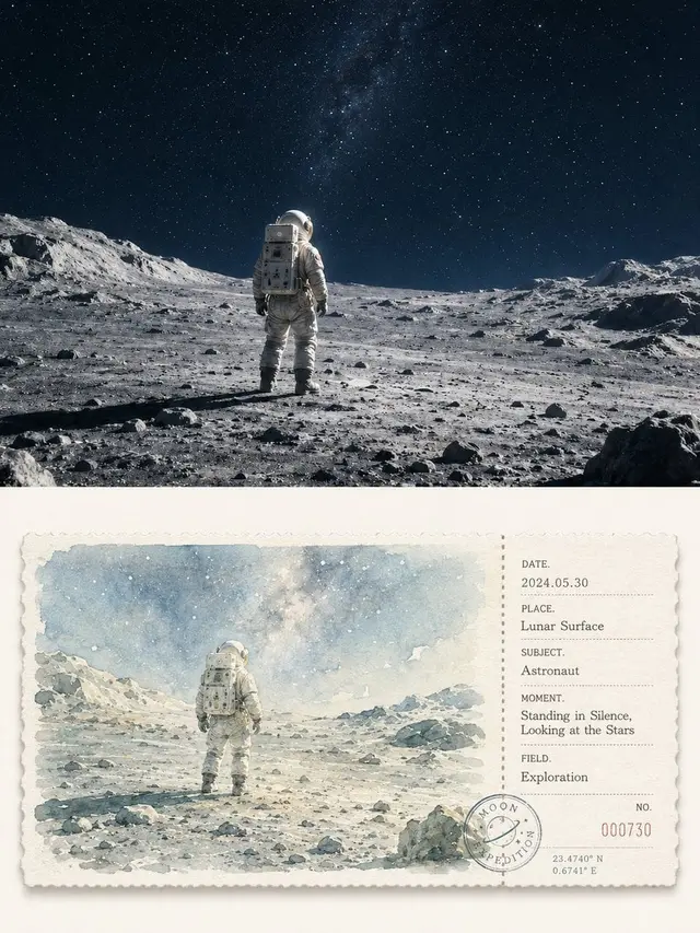
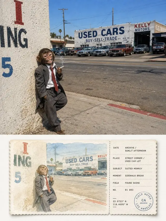
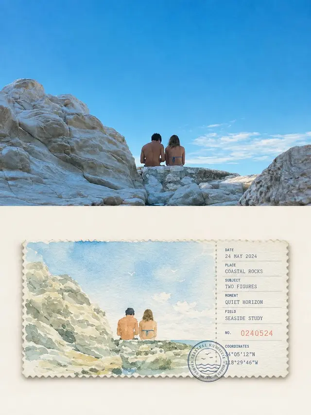
Please create an independent, high-end design poster for each photo you upload, without combining multiple images. Each photo should be output separately. The overall composition should be in a 3:4 vertical format, with the top and bottom sections each having an equal height, occupying 50% of the frame.

The top section retains the original photo, maintaining the main structure, real texture, natural lighting, and original color atmosphere. Only a slight advanced photography color grading is applied to give it the texture of an art magazine, travel publication, and exhibition photography. To fit the frame, the sky, ground, or environmental background can be naturally expanded, but the subject must not be stretched, distorted, or altered.

The bottom section extracts the most recognizable subject, outline, posture, and narrative relationship from the photo, reinterpreting the original scene into a horizontal postcard and ticket-style watercolor root. It is not to isolate a single object but to preserve the most memorable relationship between the subject and the necessary environment, reorganized with simple watercolor strokes to allow the image to correspond to the photo above while resembling a meticulously collected travel sketch ticket.

The ticket body is centrally suspended in a large area of creamy white whitespace, using a strict left-large-right-small geometric division: approximately 74% is watercolor, and approximately 26% is the information ticket stub, separated by a vertical dashed line, perforation, or tear line. The top and bottom margins are uniform, and images, text, stamps, and numbers all follow the same隐性 grid and alignment lines, forming a neat, quiet, and professional editing order. The cardstock is thick, matte watercolor paper with a fine serrated edge and a very slight natural shadow.

The left watercolor is reinterpreted with a healing color palette of high lightness and low to medium saturation, avoiding direct copying of dirty gray values. The original photo's freshest and most vital colors are prioritized, then translated into soft sage green, mist blue, light gray, cream yellow, warm sand color, light earthen color, and other natural color systems; air is created with 2-4 similar colors, and only a very small amount of warm contrasting colors are used to highlight the subject. The overall image is bright, clean, transparent, and soft, avoiding grayish, yellowish, dark brown, bright contrasting colors, and cheap vintage filters.

The watercolor strokes are clear and light, preserving the paper's transparency, soft blurring, wet and dry changes, and a small amount of grain. The subject is slightly clearer, and the distant view and secondary environment are naturally weakened, without realistic lighting and complex details, giving the image a quiet, relaxed, and gentle picture book and travel notebook feel.

The right ticket stub uses a restrained geometric information layout system, flexibly generating fields such as DATE, PLACE, SUBJECT, MOMENT, FIELD, NO. based on the content of the photo, and pairing them with dates, numbers, short lines, dot lists, coordinate-style numbers, and a circular stamp. All text is strictly aligned along a unified left line, baseline, and spacing, with clear font size levels and ample whitespace; the stamp can slightly overlap with the dividing line or bottom grid, allowing the information elements to form a clever relationship with the ticket structure rather than being scattered randomly. If the theme is not urban or travel-related, the location field can naturally be converted into object name, state, project, chapter, season, or emotional record.

The overall design references high-end travel postcards, vintage tickets, artist notebooks, watercolor publications, and modern editing design, emphasizing healing colors, geometric order, paper texture, and collectibility, presenting a fresh, gentle, quiet, neat, delicate, and not overly designed visual temperament. Avoid dirty old tones, loose layouts, floating information, complex decorations, realistic illustrations, e-commerce template feelings, and cheap vintage effects.
 桃子AI画廊Tao Image Gallery