译文
[Theme]: [Theme]
[Main Visual]: [Main Visual]
[Chinese Title]: [Chinese Title]
[English Title]: [English Title]
[Supporting Visuals]: [Supporting Visuals]
[Main Color Scheme]: [Main Color Scheme]
[Supporting Colors]: [Supporting Colors]
[Date / Institution]: [Date Institution]
[Ratio]: 9:16

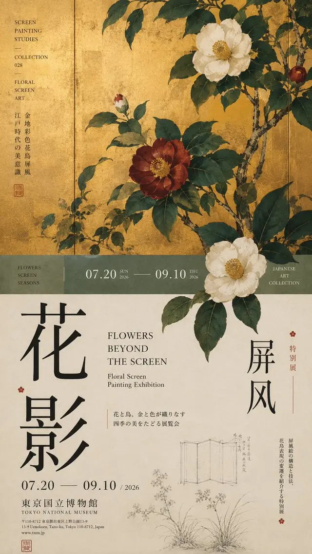
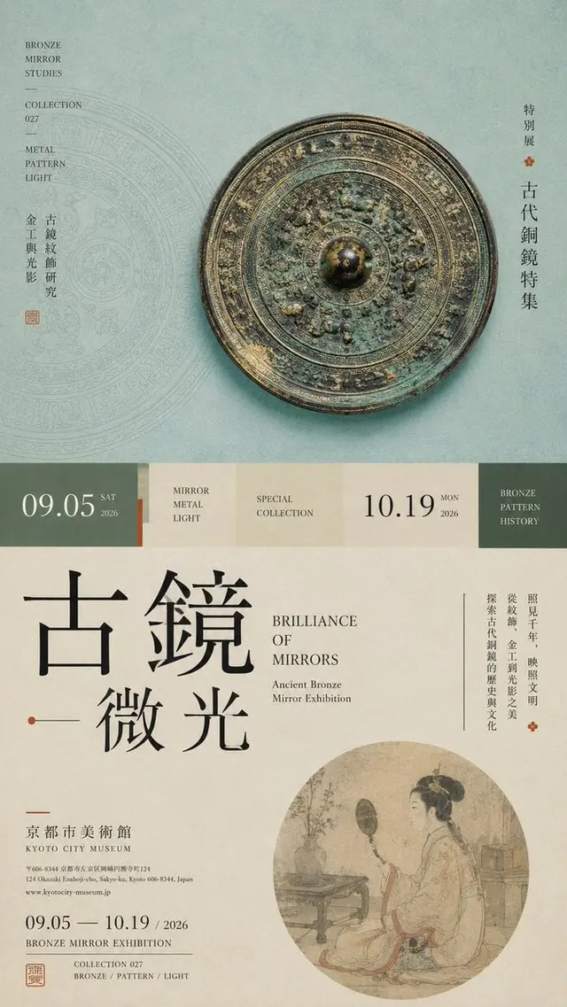
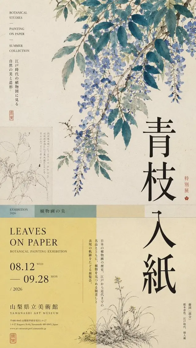
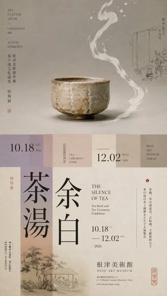
Create a poster with an advanced Editorial Design and cultural exhibition atmosphere featuring a "top and bottom cut" layout.

Do not simply create a "top image, bottom text" design. Divide the layout into 2–3 uneven vertical areas: the main visual area about 50%–65%, the middle transition cut area about 8%–15%, and the bottom information area about 25%–40%.

Only retain one main visual core [Main Visual], and add a small amount of low-weight details such as line drawings, local paintings, patterns, research diagrams, small collection information, or vertical text, allowing the blank space to have design density without overshadowing the main subject.

In the middle, low saturation color blocks, narrow color strips, or information modules can be used to connect the upper and lower areas. The main title can be composed through enlargement, vertical arrangement, offset, or cross-area participation; allow the main subject to partially cross the cut boundary, creating a sense of depth between the upper and lower areas.

Establish clear text hierarchy: Large Chinese title → English title / Date → Small subtitle → Extremely small institution information. Small text should be arranged closely, not scattered.

Color control should be limited to 3–5 colors, establishing hierarchy through area proportion, visual weight, cross-area relationships, and Typography.

Key Point: The top and bottom cut is not about cutting the image into two pieces, but about allowing different areas to have clear division of labor while reconnecting through the main subject and text.

Museum Exhibition Poster × Editorial Graphic Design, rich but not chaotic, blank but not empty, with the completion level of a real museum poster and art catalog.
 桃子AI画廊Tao Image Gallery