译文
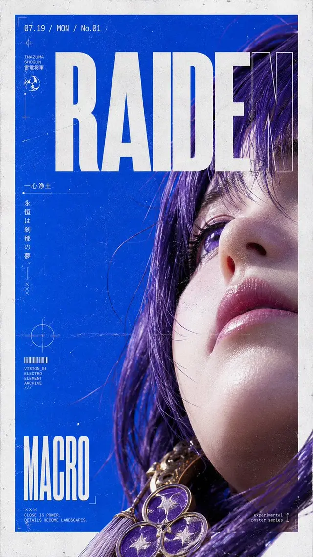
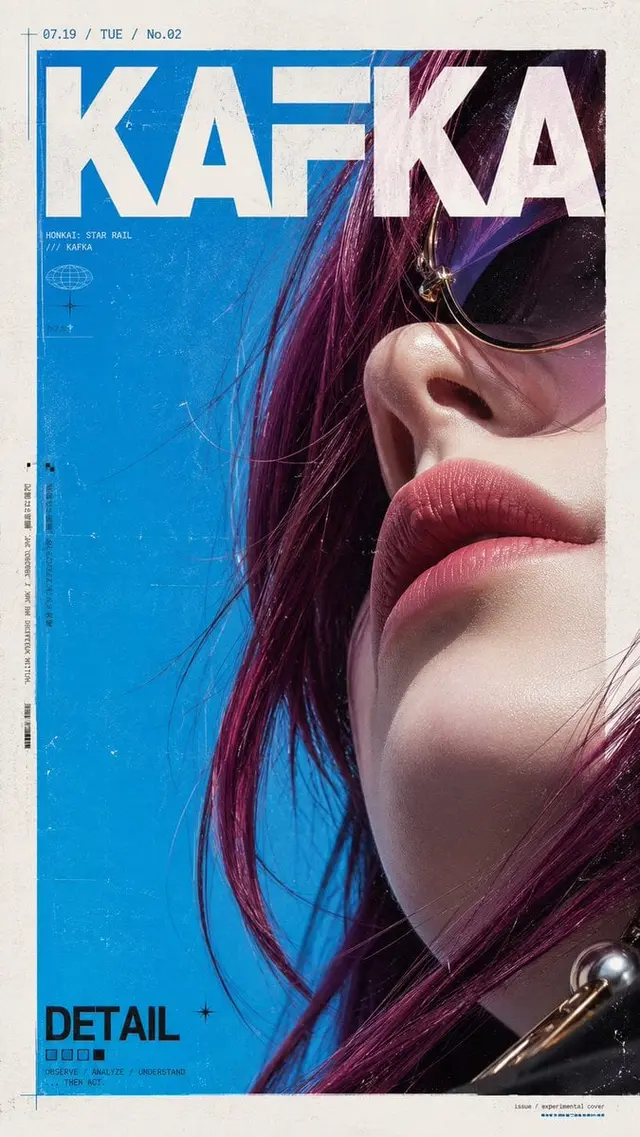
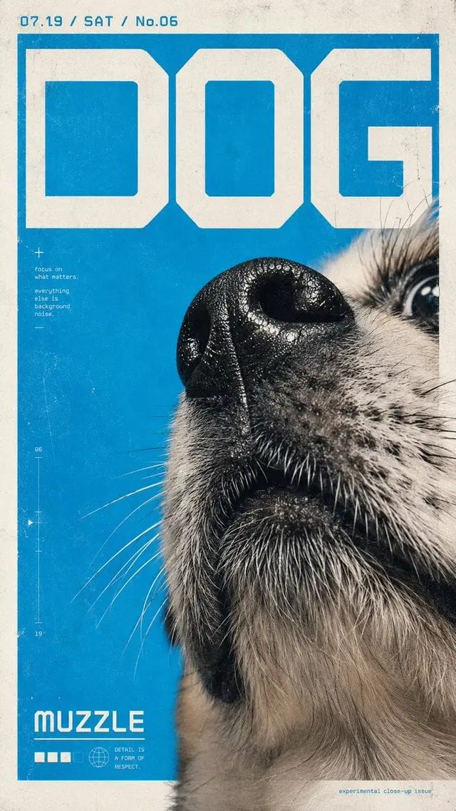
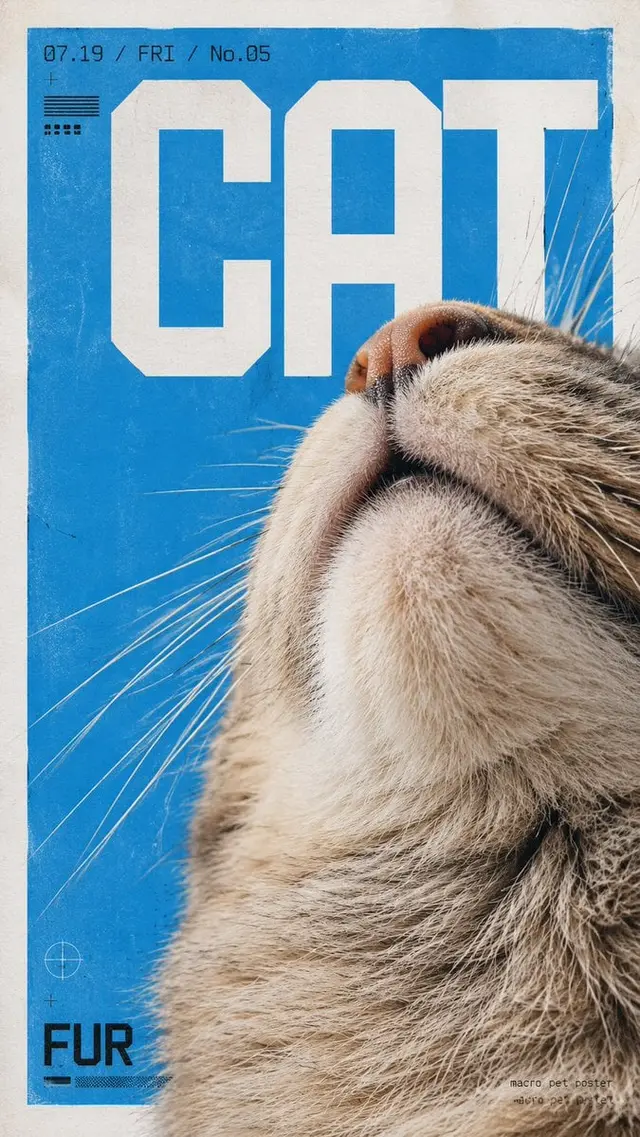
Create a vertical experimental design poster, with the theme of [Subject]. The overall style combines ultra-closeup macro photography, Japanese experimental graphic design, Swiss grid layout, Y2K geometric digital fonts, independent magazine cover feel, and print poster texture.

[Subject] is presented in an extremely close-up局部特写 manner, not aiming for a complete display, but rather choosing the most recognizable parts to enter the frame, such as the face, nose tip, mouth, chin, hair, surface textures, edge contours, or structural details. The camera uses ultra-low-angle close-up仰拍 or tight wide-angle macro perspective, creating a distinct near-large-far-small perspective and the visual effect of "everyday objects being photographed as giant landscapes".

The composition is in a 9:16 vertical format. The outer frame retains a clean, large white border, and the main subject area is like a vertical poster embedded on the paper surface. The subject cuts in from one side of the frame and extends beyond the edge, creating a strong sense of cutting and volume compression. The subject usually occupies the lower and rightmost parts of the frame, with a large area of pure background color on the other side, forming a striking visual blank and dynamic balance.

The background uses a high-saturation, pure monochrome base, prioritizing bright sky blue, cyan, ice blue, electric blue, etc., creating a sharp contrast in cold and warm colors with the subject. If the subject has warm-colored hair, skin, metal, wood, or surface textures, they should stand out more against the blue background. The overall color scheme maintains simplicity, brightness, and restraint, with 1 main color + subject color + white paper as the core.

Large-scale geometric display text is added to the layout, where text is not just information but also a graphic structure. The font should have ultra-bold sans-serif, geometric angles, modular strokes, digital, futuristic, and architectural qualities, spanning across the upper or mid-upper part of the frame in large blocky forms, intersecting, overlapping, cutting, and overlapping with the subject. Text can take the form of titles, abbreviations, letters, numbers, dates, short words, etc., with a focus on visual造型感 rather than information quantity.

A small group of information such as date/number/day/issue number is added to the upper left or top corner, using narrow, tech-savvy fonts. A larger style word or title can be placed in the lower left corner. An extremely small information layout can be added to the lower right corner, such as poster number, design signature, series name, or short sentence description. The overall text system forms a hierarchical relationship of giant title + small auxiliary information + micro corner layout.

The image texture emphasizes the feeling of combining photography and printing. The surface of the frame adds delicate grains, paper textures, slight wear, scratches, fading, uneven ink, old poster friction marks, screen printing feel, Risograph atmosphere, and slight photocopied poster texture. The background color blocks are not absolute digital flat painting but have slight speckles and grains. The subject details remain sufficiently clear, especially the hair, skin, edges, whiskers, fibers, reflections, and other microscopic textures.

The overall atmosphere should present a sense of cold humor, youth culture, independent design, experimental visuals, and a blend of cute and hardcore. The frame has a strong sense of graphic design while retaining the real tactile sensation of the photographic object. The final effect is like an independent design poster / trendy magazine cover / pet art poster / experimental visual poster.
 桃子AI画廊Tao Image Gallery