译文
You are a top-class advertising creative director, art director, travel photographer, editorial designer, and expert in Japanese typography.

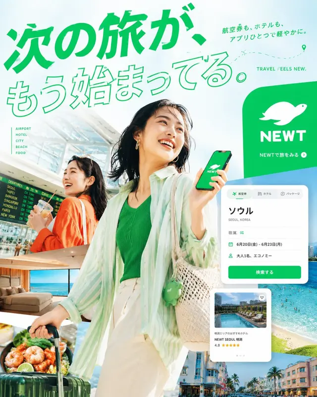
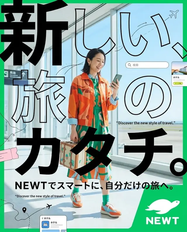
Create a high-quality, real-life editorial poster for NEWT's travel app advertisement, using the attached NEWT logo and in a vertical format of 4:5.

The goal of this poster is not just to create a beautiful travel advertisement.
It should evoke the following emotions in the viewer, even if they only see it for a moment on their smartphone:

* Feel the urge to go on a trip
* Feel attracted to this world view
* Feel the desire to see more with NEWT

⸻

1. Overall Tone of the Screen

The overall impression should be bright, translucent, high saturation, urban, and sophisticated.
The base should be NEWT Green, with 1-2 bright colors like Sky Blue, Turquoise, Sunset Orange, and Fluorescent Yellow added effectively.

Avoid the following directions:

* Dark indoor-centered screen
* Grey-based, somber impression
* Looking like a cheap package tour advertisement
* Layout like an old travel brochure

⸻

2. Photography Expression and Character Design

The core of the advertisement is a high-quality real-life travel visual.
Integrate the following elements strongly within one poster:

* Travelers
* Airport
* Hotel
* Urban scenery
* Sea
* Food
* App experience on the smartphone

Characters should be Japanese or East Asian models, but there is no need to resemble celebrities. Emphasize natural expressions, skin, and hand expressions.

The clothing should be styled in a way that is suitable for a travel advertisement, not just ordinary work attire or safe clothing. The ideal look should convey the excitement of going on a trip and an urban, sensitive lifestyle.

⸻

3. Structure Should Be "Boldly Deformed"

Do not settle for the usual "simply placed characters, text, and logo" in advertisements.
This poster needs to have a memorable structure that is itself memorable.

Especially welcome the following designs:

* Use the silhouette of NEWT's turtle logo as a large frame or cut-out, and develop the travel scenery within it
* Boldly divide the screen with large circles, waves, ticket shapes, app card shapes, map lines, etc.
* Do not arrange the photos in simple rectangles, but use diagonals, curves, cutouts, and overlaps
* Clash the large Japanese typography with the photo, creating a dynamic force as some of the text cuts off the screen
* Naturally overlap graphic elements such as smartphone UI, flight ticket cards, hotel cards, map pins, and flight lines
* Avoid safe left-right division and create a sense of dissonance that stops the gaze with shifts, margins, cuts, and overlaps

⸻

4. Copy to Definitely Include

Main Copy

The next trip is already started.

Sub Copy

Flight tickets and hotels, all with one app.

CTA

See the trip with NEWT

Small English

TRAVEL FEELS NEW.

⸻

5. Handling of Text

In this poster, Japanese typography should be the most important visual element.
It should not just be about reading the text, but aiming for a state where the text itself becomes the main character of the screen.

Avoid the following treatments:

* Simple headings with just white text
* Just pouring in pre-existing fonts
* Looking like a Canva template
* First view style of LP
* Discount banner-like cheap appearance

Recommended text treatments include:

* Large outline text
* Bold Gothic
* Long-body treatment
* Combination of vertical and horizontal layouts
* Cuts
* Eating into the photo
* Integration of typography with characters, landscapes, and UI

⸻

6. Use of Logo

The NEWT logo must be used.
However, do not just stick it in the corner but integrate it naturally into the structure of the poster.
While it needs to be recognizable as a brand, avoid a state where the logo stands out alone.

⸻

7. The Ultimate Desired Completion

The final product should have the quality of elements across the following:

* Urban travel campaign advertisement
* High-sensitivity culture magazine travel special cover
* Airline company seasonal visual
* High-quality advertising expression of hotel brands

In other words, a bright, sophisticated, high-budget feeling, and high editorial travel advertisement.

⸻

8. No-Gos

Absolutely avoid the following directions:

* Looking like a budget travel brochure
* Having an air of information material banners
* Artificially beautiful characters with strong AI beauty
* Ordinary business attire
* Visuals centered on dark indoor spaces
* A composition that prominently highlights price appeals
* Difficult to read, broken Japanese
* Amateurish layout with photos and text scattered
* Too safe left-right division structure
 桃子AI画廊Tao Image Gallery