译文
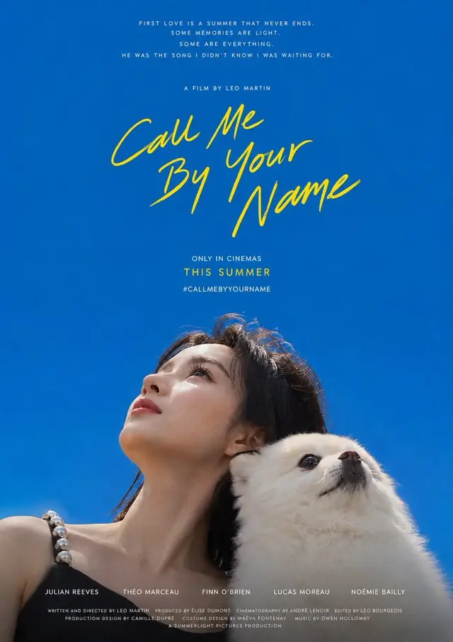
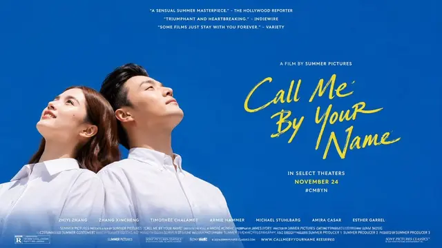
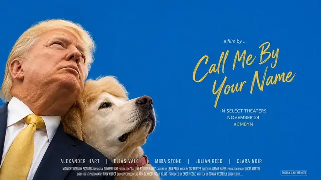
Create a portrait-style movie poster based on the user-provided photo, with the core element being a vast field of pure color supporting the subjects leaning against the edge of the image, each gazing up at the sky. Approximately three-quarters of the entire image is a solid, saturated, and debris-free monochromatic field, resembling an infinitely distant sky, creating a sense of openness, longing, and summery breathing space; the subjects occupy only a narrow strip on one side of the image, about a quarter of the width, leaving most of the space to the vast color field. The composition adapts to the aspect ratio: in portrait mode, the subjects are aligned along the bottom of the image in a low horizontal row, with the sky extending upwards; in landscape mode, the subjects are aligned along one side of the image (such as the left side) in a vertical row, with the vast color field spreading out to the other side (such as the right side), with text placed in that open space; regardless of the orientation, the subjects and text are always positioned at the ends, with negative space dominating. The camera angle must be a very low angle shot from below (bug's perspective): each character's head is tilted back, the chin raised, and the neck stretched, facing upwards towards the vast color field at the top, with the viewer mainly seeing the lower jawline and the silhouette or three-quarter profile of the side face—the characters never face the camera directly, never make eye contact with the camera, never pose for a frontal ID-style portrait, and their gaze is not directed towards the viewer but towards the sky above. Only the head, shoulders, and a small part of the upper body are visible, with the lower edge naturally cut off by the edge of the image.

There are no restrictions on the subject objects; everything is based on the actual objects appearing in the input photo; their identity, quantity, type, and combination must strictly correspond to the original photo, without any arbitrary proliferation, duplication, breeding, or addition of objects outside the image. The key posture of leaning is interdependent rather than looking in the same direction: each object is leaning against the other's back, heads touching, or one side's back and head leaning against the other's shoulder and neck, leaning towards opposite or different directions, each object tilting their heads upwards towards their own side of the sky, their gaze scattered towards different directions of the open color field, rather than converging on a single focal point; each object maintains a raised chin and an upward gaze, conveying a sense of leaning, intimacy, and individual absorption. Unless the user explicitly requests repetition or mirroring, do not duplicate the same face or object multiple times.

Place handwritten, brushstroke-thin, and slightly connected title text in the vast empty space away from the subjects, with a casual, slightly slanted, and hand-drawn style, arranged in two to three lines in a staggered layout, using a bright contrasting color (a bright yellow tone, which can be slightly adjusted according to the theme emotion) that forms a warm contrast with the main color field, making the text appear as if floating in the air. The default content of the title text is the handwritten English "Call Me By Your Name," which is replaced with the user-specified content only when the user provides custom text. The position of the title adapts to the aspect ratio: in portrait mode, it is placed in the middle upper part of the upper empty space, and in landscape mode, it is placed in the central large blank space opposite the subjects. Place a line of smaller, thin, explanatory text (default "a film by …" style) above the title, and two to three lines of smaller emphasis or white uppercase information lines (default "IN SELECT THEATERS / NOVEMBER 24 / #CMBYN" such as theater release and tagline, which can be customized) below the title; in the portrait version, an additional stack of several very small white movie review quote-style short sentences can be centered at the top, and a line of white uppercase main cast names and a dense,低调, small copyright information strip can be placed at the bottom, forming a complete movie poster text order.

The main color field defaults to the pure, saturated, slightly deeper cobalt blue/azure color of the original work—like the clear blue of a sunny summer noon sky, approximately #0A66AC (red very low, green in the middle, blue higher), distinctly blue without greenish, gray, purple, pale blue, or dark blue tones; it is only replaced with other theme colors when specified by the user, while still maintaining the same purity, saturation, and high luminance relationship. The overall color role is: a large single area of pure high luminance color field dominates, a warm handwritten emphasis color (default bright yellow) acts as a highlight, white text carries information, and characters retain their real natural skin and clothing colors. The image is bright, transparent, clean, saturated, and not dirty, with a gentle sense of openness and longing; even when using a deeper color field, it must maintain a clear light feeling, clear color gradation, and breathable negative space, avoiding gray, old, stuffy, dirty, or worn-out effects. The visual weight is firmly focused on the contrast between the vast empty space and the subjects looking upwards at the edge, with the subjects never filling the entire frame, never shot straight-on, and never losing a large amount of negative space and an upward scattered gaze.
 桃子AI画廊Tao Image Gallery